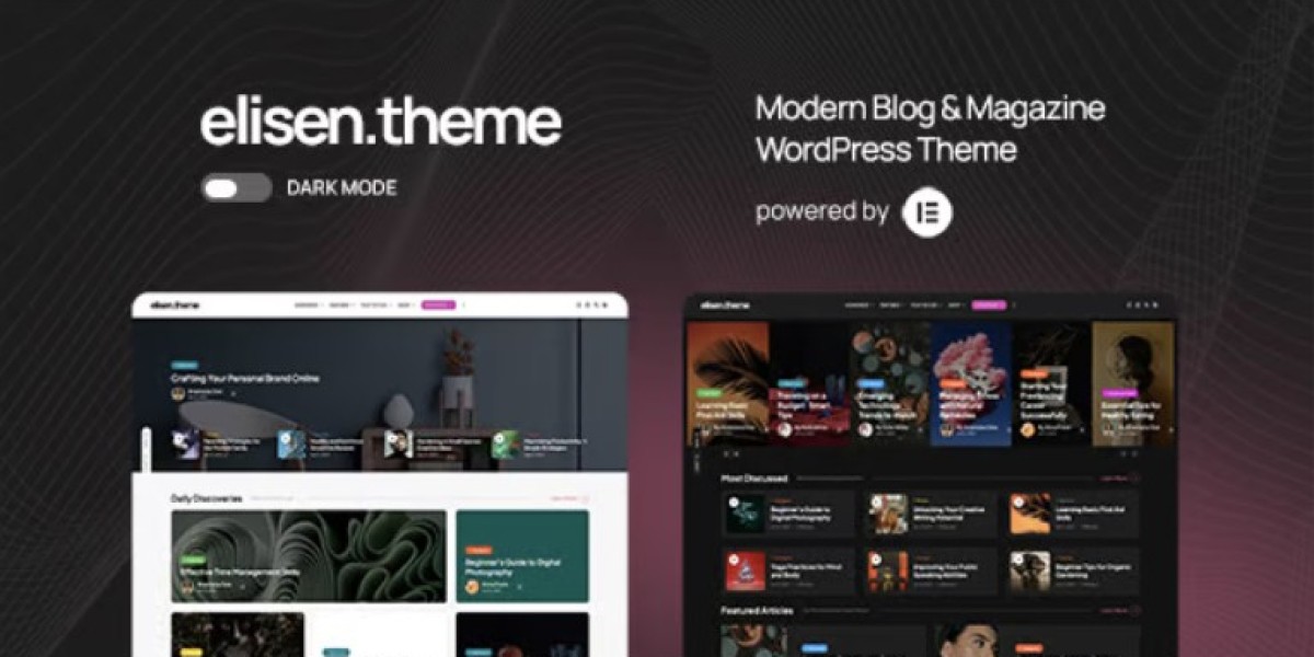
Elisen in the Real World: A Magazine Admin’s Long-Form Review
I’m going to write this one like a newsroom memo—half story, half operating manual—because that’s how I experienced the rebuild. A few months ago I migrated a cluttered, aging publication site to Elisen – Blog & Magazine WordPress Theme, and the change wasn’t cosmetic. It reshaped how we published, how we organized stories, and how easy it was for non-technical editors to keep the site consistent across daily updates. If you’re a site admin for a blog, magazine, or content brand, you already know that “pretty demo pages” aren’t the hard part. The hard part is keeping order while your content grows faster than your team.
This post is long on purpose. A theme for editorial sites isn’t judged by how it looks on day one; it’s judged by whether it still works when you’re on day 400 with thousands of posts, dozens of categories, and multiple editors who don’t always follow your rules. I’ll walk you through why I chose Elisen, what I did in staging, how I structured the content architecture, how the homepage and category flows were shaped, what actually mattered for performance and SEO, and what I’d do differently next time. I’ll also compare against the common alternatives I considered.
1. The situation: an editorial site that drifted into chaos
The old site was a classic content machine that grew too quickly and was redesigned too many times. It started small: a weekly blog, one author, a few categories. Then it added contributors, verticals, a newsletter, and a carousel of “special issues.” Nothing was wrong at first—until the content volume made every tiny inconsistency multiply.
Here’s what drift looked like from my admin chair:
Homepage became a collage.
Every editor felt entitled to “feature something.” Over time the hero area turned into a patchwork of competing cards, sliders, and random “special picks.” You couldn’t tell what the publication was about in ten seconds.Categories stopped meaning anything.
People created new categories for every trend. Some sections overlapped, others were abandoned, and the archive pages were either too long or too empty.Typography and spacing varied across posts.
Editors pasted content from Google Docs, Notion, or Markdown, and then tweaked formatting in the block editor. After a year, every post felt like it belonged to a different brand.Featured layouts were inconsistent.
A story might be “featured” on home but normal inside the category archive, or vice versa. The editorial hierarchy was unclear.Speed degraded month by month.
Every redesign added a plugin. Every plugin added scripts. Every script added a little more load. By the time I arrived, mobile performance was suffering and layout shifts were visible.Editors were afraid to update.
This is the quiet killer. If an editor thinks “touching the homepage might break it,” then they hesitate. The site freezes. Fresh content is published into a stale shell.
We didn’t need a new coat of paint. We needed a theme that assumed a serious editorial workflow.
2. What I needed the theme to do (editorial spec, not design spec)
Before I opened a theme demo gallery, I wrote an admin spec. This prevented me from choosing based on aesthetics alone.
Visitor experience must support
Fast content discovery
People land on home, find a vertical, and fall into reading trails.Clear hierarchy of importance
Top stories feel top. Editors can control emphasis without hacking layouts.Excellent mobile reading
Most readers arrive on phones. If the typography and spacing aren’t steady on mobile, bounce rates explode.Archives that don’t feel endless
Category and tag pages must be scan-friendly and filterable.A consistent “publication voice” visually
Readers should feel the brand even when the writers differ.
Admin/editor workflow must support
A stable homepage that multiple editors can update safely
Predictable post templates with minimal formatting choices
Easy vertical/category management
Clean feature/pin system
No-drift layouts as content scales
Performance stability without plugin spaghetti
With that spec in mind, Elisen immediately stood out because its demo structure was editorial-native: not a general “agency blog” layout pretending to be a magazine.
3. Why I opted for Elisen over a generic base
I always review broader catalogs when choosing a theme. I checked a range of Multipurpose Themes to see whether I was missing a universal solution, because universal themes do offer flexibility. But for editorial sites, flexibility can be a trap.
Here’s the reality:
Generic themes often prioritize landing pages.
Editorial sites prioritize reading journeys.Generic archives are often afterthoughts.
Editorial archives are the product.Generic themes assume an admin will “design” every section.
Editorial themes assume an admin will “organize” every section.
Elisen’s layouts are built around content hierarchy and repeatability. When a theme expects your site to behave like a magazine, it saves admin time every week after launch—not just on launch day.
4. My staging workflow (how I avoid painful editorial migrations)
For content sites, staging is not optional. You’re dealing with thousands of posts and a fragile distribution of tags, categories, and old URLs.
Here’s my path:
Clone production environment
Same PHP, caching settings, CDN, permalink rules, and media paths.Install Elisen and import demo content
I imported the demo to learn the intended structure, not to copy it.Map demo blocks to real editorial needs
I looked at each block and asked:Can editors maintain this weekly?
Does it help discovery?
Will it scale?
Strip demo clutter early
I removed any decorative blocks that would become a maintenance burden.Rebuild home + archives with real data
Real content reveals real weaknesses fast.Run archive stress tests
I loaded category pages with hundreds of posts, tested pagination and scan behavior, and verified that featured areas didn’t collapse visually.
Elisen passed these tests without me reaching for extra builder plugins.
5. Content architecture reset: fewer categories, stronger verticals
The hardest part of any editorial rebuild isn’t CSS. It’s taxonomy discipline.
We started with a messy system: 50+ categories, half redundant. I reduced it to a cleaner model.
5.1 Vertical categories (top level)
We kept 7 top-level verticals:
Tech & Product
Business & Markets
Culture & Society
Design & Creativity
Science & Future
Lifestyle & Wellness
Opinion / Essays
Each vertical had a clear brief. No new vertical without admin approval.
5.2 Sub-categories (only where useful)
Each vertical got at most 4–6 sub-categories, based on consistent user intent. Example inside Tech & Product:
AI & Automation
Startups
Software Dev
Tools & Reviews
Product Thinking
I refused to add sub-categories for short-term trends. Trends belong in tags, not categories.
5.3 Tag cleanup
Tags were kept as the “floating layer.” But they needed rules:
no duplicate tags with different casing
avoid near-synonyms
prefer tags that represent stable topics
Elisen’s archive UI made this architecture feel clean rather than sparse. The layout lets verticals breathe.
6. Homepage rebuild: a newsroom front page, not a Pinterest board
Elisen gives you multiple homepage patterns. I used a journalistic hierarchy instead of a “marketing grid.”
Final homepage order
Hero top story
One flagship piece with clear emphasis and a calm layout.
No massive slider. No five competing cards.Top-three editorial picks
The editor-in-chief can control these weekly.Vertical highlights
Each vertical had a small, consistent card row.
The admin rule: never exceed one row per vertical.Trending / most read lane
Helpful for discovery, but visually balanced so it doesn’t overpower curated picks.Latest stories stream
A clean river of newest posts.
The key is spacing and typography consistency.Newsletter invite
A soft CTA that doesn’t scream.
This layout is quiet but confident. It makes the publication feel deliberate. Elisen’s spacing and font rhythm supports this “front page” attitude naturally.
7. Post template discipline: consistency beats personal styling
The block editor is dangerous for editorial brands because it gives every writer too much freedom. The solution isn’t to ban blocks; it’s to lock a predictable template.
My Elisen post template rules
One H1 only, no custom sizes
H2 for section breaks only
Short paragraphs, no walls of text
Images follow one width style
No random color blocks unless approved
Quotes use the theme’s default style
I created a post layout checklist and trained editors on it.
Elisen makes this easier because its default typography looks strong without extra decoration. Editors didn’t feel compelled to “make it prettier” manually.
8. Featured mechanics: controlling importance safely
Editorial sites live on hierarchy. You need to pin and feature without rebuilding layout every time.
Elisen supports:
a main featured area
secondary feature areas
category-level features
From an admin perspective, the advantage is that you control emphasis by toggling selection, not by dragging blocks around. That’s a big difference. When hierarchy is selection-driven, editors can update safely without breaking structure.
I set rules:
only one “front page anchor” story
three secondary picks max
category pages can pin one lead story
no more than five pinned stories per vertical
This kept the site from feeling over-curated while still giving the editorial team control.
9. Category and tag archives: where magazines live or die
Most readers don’t enter a magazine through your homepage. They enter through a category archive, a tag page, or a search result.
So archives must feel like a product, not a dumping ground.
9.1 Category page anatomy I used
Each category page had:
A short intro (1 paragraph)
One pinned lead story
A clean grid/river of posts
Stable pagination
Optional “related tags” lane at bottom
Elisen’s archive layouts are properly tuned for scanning. Cards are large enough for visual context but not so large that you lose information density.
9.2 Tag pages for discovery
I made tag pages simple, consistent, and fast. Some themes give tags a weak default design, making them feel like accidents. Elisen handles them as first-class archives.
10. Mobile reading: testing the real thing, not the demo
I tested Elisen on real devices because thumbnail-perfect demos often hide bad mobile behavior.
What I checked
line length and font size on phones
paragraph spacing
readability of pull quotes
how images behave in rivers
tap targets for category navigation
sticky elements and their impact on reading flow
Elisen passed without tweaks. It doesn’t overload mobile with floating UI.
If your readers can comfortably read two articles back-to-back without fatigue, you’ve already won half the battle.
11. Performance: how Elisen stayed stable as content grew
Editorial sites deteriorate performance quietly. The theme can’t fix everything, but it can avoid adding weight.
My baseline checks
home LCP on mobile
CLS on hero + archive pages
script count and size
lazy loading behavior
caching compatibility
archive query efficiency
Elisen is not script-heavy by default. It didn’t bring a parade of moveable parts. That gave me room to optimize media and caching without fighting a bloated front end.
Admin rules that mattered more than theme speed
Compress images before upload
Standardize featured image sizes
Avoid autoplay media blocks
Limit embedded third-party widgets
Keep homepage blocks minimal and stable
Because Elisen’s layouts still look premium under compressed media, these rules didn’t harm design.
12. SEO posture: structure first, volume second
Magazine SEO is not just “publish more posts.” It’s about predictable structure and linking patterns.
12.1 Internal linking via verticals
Every post links to:
its vertical archive
1–3 related posts in the same topic cluster
Elisen’s related-posts area is clean enough to use without a separate plugin.
12.2 Category pages as long-tail landing hubs
With the simplified vertical architecture, category pages became stable landing hubs. Search engines love that.
consistent naming
clear intros
a pinned lead story
steady activity
Elisen’s category layouts made these hubs feel intentional, not cluttered.
12.3 Clean author pages
Author archives matter for E-E-A-T signals. I made sure author pages were readable and not buried. Elisen’s author layouts are simple and credible.
12.4 Pagination clarity
I kept classic pagination rather than infinite scroll for archives. Infinite scroll can hide depth from both machines and humans. Elisen’s paging UI is clean.
13. Editorial workflows the theme supported unusually well
Some theme advantages only appear once you’re in routine.
13.1 Weekly “edition reset”
Every Monday the editorial lead updates:
top hero
three featured picks
vertical highlights
On Elisen, this is a low-risk operation. You don’t rearrange blocks; you replace selections.
13.2 New vertical launch
When a new vertical was approved, Elisen allowed us to add it cleanly without redesigning navigation. The vertical block styles remain consistent.
13.3 Special issue landing pages
We ran occasional “special issues” (like thematic collections). Elisen’s layout system made these collections look native instead of like alien landing pages pasted into the site.
14. What I compared against (the honest alternatives)
14.1 Generic multipurpose themes
Pros:
huge demo choice
flexible layout builders
Cons for editorial:
archives feel secondary
too much styling freedom for editors
hierarchy requires manual layout dragging
drift becomes inevitable
often heavier scripts
14.2 Minimal blog themes
Pros:
fast and clean
great for single-author sites
Cons for magazine scale:
weak hierarchy controls
limited archive personality
category pages feel thin
featured systems often absent
less room for visual storytelling
Elisen sits between these extremes: structured enough for magazines, clean enough for daily blogging.
15. Who Elisen is best for (from an admin lens)
I’d recommend Elisen to:
Digital magazines
Multiple verticals, daily updates, a need for stable front pages.Newsletters that grew into publications
Where archives and categories suddenly matter a lot.Multi-author blogs
Especially if editors need hierarchy without layout chaos.Niche content brands
Tech, design, finance, culture, or any vertical-based publication.Hybrid editorial + light ecommerce
Where the editorial side remains the main identity.
It’s less ideal if your “blog” is just an afterthought attached to a corporate site. Elisen shines when content is your product.
16. Mistakes I avoided (and why it mattered)
Over-featuring
Too many “featured” areas make the homepage feel like an ad board. Elisen gives multiple feature options, but discipline is still required.Re-creating old categories
I resisted pressure to rebuild the messy taxonomy. The new architecture was enforced for a reason.Letting editors freestyle blocks
If you don’t define a post template, any theme will drift.Homepage experimentation in production
I banned live home experiments. Staging first.Ignoring author identity
Author pages are part of trust. Elisen made them look clean, so we used them actively.
17. Scaling expectations: 1,000 posts in, 10,000 posts in
A theme that works for 20 posts can collapse at 2,000.
Elisen scales because:
archives remain readable
card density stays balanced
hierarchy continues to work without redesign
typography remains stable
the layout system doesn’t depend on fragile page-builder grids
The real scaling risk isn’t Elisen. It’s taxonomy drift and uncompressed media. If you control those, the theme stays strong.
18. What I’d do differently next time
Every rebuild teaches you something.
Two improvements I’d adopt earlier:
A stricter tag governance dashboard
Tags creep silently. Next time I’d schedule monthly tag audits from day one.A clearer “series” system
We eventually created series pages for recurring columns. Elisen supported them fine, but I wish I’d planned series earlier so internal linking would be more systematic.
Both are process lessons, not theme limitations.
19. My repeatable Elisen deployment order
If I were rebuilding another editorial site tomorrow:
Install Elisen on staging
Import demo, map intended structure
Strip demo to essential blocks
Rewrite taxonomy (verticals + limited sub-cats)
Lock post template rules
Build homepage hierarchy
Configure featured mechanics
Tune category/tag archives
Enforce media compression standards
Train editors on workflow and hierarchy
Launch with a quiet first week
Audit monthly for drift
This order prevents the two disasters editorial sites always face: layout drift and taxonomy explosion.
Closing thoughts
Elisen worked for me because it behaves like an editorial system, not a generic blog skin. It gave us a stable hierarchy, strong archives, predictable feature controls, and typography that editors didn’t feel obliged to “fix.” That let our team focus on content rather than layout babysitting. The site became easier to maintain, faster to browse, and more coherent as a brand.
If you’re a WordPress admin responsible for a blog or magazine that publishes frequently, has multiple authors, and needs a trustworthy “front page” feel without constant redesign, Elisen is the kind of foundation that keeps working long after the launch excitement wears off.