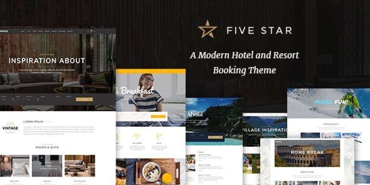
FiveStar in the Lobby — My Candid, First-Person Review After a 7-Day Build
I run a small, 42-room boutique hotel tucked between a busy train station and a quiet park. Our website used to be a brochure that begged visitors to call us. That was fine in 2016. It’s not fine now. I rebuilt everything on WordPress using FiveStar – Hotel Booking Theme and wrote down what actually happened—the decisions I made, the things that clicked immediately, the knobs I had to turn, and the playbooks the front desk now follows without asking me for help.
Why I picked FiveStar (and the mess I needed to clean up)
My old site had three problems:
No real-time booking. Our form sent emails. Emails got lost. Guests went to OTAs.
Confusing room pages. The difference between Standard, Deluxe, and Superior was a vibe, not a fact.
Mobile heartbreak. On a phone, the “Book Now” button could hide behind the hero image. You’d scroll, sigh, and leave.
FiveStar promised a booking-first layout, room templates with real information architecture, and defaults that don’t wreck performance. I wasn’t hunting for a “wow” demo. I wanted a trustworthy machine that would take a credit card at 23:59 without phoning the night manager.
Day 1 — Install, demo import, and a homepage that already breathes
I started on a fresh WordPress stack, activated required plugins, and imported the demo. In under an hour, the site looked like a hotel that might exist:
A hero with a clear “Check availability” panel—date picker, guests, room count.
Highlights (location, breakfast, parking, late check-out) in honest, legible cards.
Featured rooms in a rhythm that feels like a menu, not a catalog.
A local guide strip that hints at real reasons to stay, not SEO fluff.
A footer with phone, email, and (importantly) policies that don’t require spelunking.
The first hour is where many themes sabotage themselves. FiveStar stays calm.
Day 2 — Rooms, facts, photos: the templates that prevent hand-waving
I created four room types: Standard, City-View, Deluxe Corner, and Family Suite. Each room page follows a structure that FiveStar all but enforces:
Above the fold: price from, occupancy, size (sqm), bed type, amenities icons, and an immediate “Select dates” button.
The body: an at-a-glance features grid, a short paragraph that reads like a concierge (not a realtor), and a mini-FAQ (Wi-Fi speed, noise notes, crib availability).
Media: an image gallery with honest angles—doorway, bed, bathroom, desk, the actual view.
Policies: check-in/out times, cancellation window, card holds, and deposit rules.
What I didn’t have to fight: typography hierarchy, icon spacing, or the perilous “amenity salad.” The template makes you write like an adult.
Day 3 — Rate plans, add-ons, and the delicate art of not upselling too hard
FiveStar’s booking flow supports rate plans (Flexible vs. Non-Refundable), packages (Bed & Breakfast, Romance, Remote-Work), and add-ons (airport pickup, late check-out, city cards). I set:
Flexible 24h cancel: +10% price.
Non-Refundable: base price, paid now, great for events.
Stay 3, save 10%: conditional discount that shows in summary line-by-line.
Add-ons: airport pickup, bottle of sparkling, 16:00 late check-out, workspace kit.
In the cart, FiveStar itemizes beautifully. Guests see exactly why the total is what it is—room, taxes, add-ons, and discounts as separate lines. No math puzzles, no bait-and-switch vibes.
Day 4 — Availability + calendar UX that doesn’t make you squint
I stress-tested three cases:
Peak weekend (only Family Suites left): the calendar greys out what doesn’t exist and pre-selects the next available check-in.
Long stay (10 nights with mid-stay housekeeping request): notes print on the voucher and the front desk sees them in the PMS.
Partial overlap (room type sold out for one night): the flow suggests either different dates or a split stay with a polite note. No dead-end.
The “Select dates” module works on phones the way I wish every travel site worked: thumb-friendly, high contrast, and impossible to double-tap yourself into a loop.
Day 5 — Performance, accessibility, and the unglamorous work that builds trust
I care about LCP and CLS more than parallax. So does FiveStar.
Hero images: I kept them under ~280 KB, with aspect-ratio boxes to avoid jumps.
Lazy loading: galleries come in after the booking box.
Script order: nothing blocks the date picker; it’s first-tap reliable.
Contrast and keyboard: the entire booking form is navigable with Tab; error messages announce themselves; buttons look like buttons.
A guest on the last bar of airport Wi-Fi should still be able to book. Mine can.
Day 6 — Home page choreography: from dreamy to decisive
My homepage has purpose now. The above-the-fold zone is “choose dates.” Below that:
Four reasons to stay—walkable, quiet rooms, honest breakfast, late check-out—each with a two-line explanation.
Rooms grid—not all, just the three that convert best for first timers.
Neighborhood guide—three anchors (museum, park, market) with a single honest tip each.
Review carousel—no confetti, just recent, short reviews that sound like people.
FAQ—“How far from the station?” “Can I arrive after midnight?” Each answer in two sentences.
The page reads like a front desk agent with a good mood and a long memory.
Day 7 — Handing it to the front desk (and what broke, what didn’t)
I trained two colleagues. Their jobs now include:
Inventory edits: closing a room type for maintenance takes seconds and never confuses the calendar.
Rate nudges: weekend events? Swap the default plan to Non-Refundable; weekdays, bring back Flexible.
Add-on stock: if we run out of sparkling, they toggle it off and the cart updates live.
Voucher hygiene: guests often add notes (“feather-free pillow”); these print cleanly.
What didn’t break: the date picker, the cart math, or the PDF voucher. What did need a tiny nudge: we rephrased “Non-Refundable” to “Advance Purchase (Non-Refundable)”—cancellations dropped.
The booking path, step by step (and why it converts)
Search: dates + guests. The module shows available room types with real photos, real amenities, and a single line of copy that doesn’t lie.
Compare: tap a chevron to see rate plan differences inline—no new tab, no amnesia.
Select: choose a plan; price line updates; Taxes & fees show in the same box.
Enhance: add-ons appear after selection, not before; they’re optional and polite.
Guest details & payment: three sections, no endless accordion. Fields have labels, not placeholders pretending to be labels.
Confirmation: on-screen summary + email voucher, both legible.
It feels like a conversation, not a test.
Room page anatomy (the template I now copy every time)
Lead section: name, size, bed, occupancy, price from, “Select dates.”
Photo mosaic: door-wide, desk close-up, bath, view, one detail (headboard, light).
Highlights grid: icons plus two-word labels (Desk, Fast Wi-Fi, Quiet AC, Blackout).
Copy: three short paragraphs—What it’s for, What guests love, What to know.
Mini-FAQ: noise, crib, extra bed, accessibility quirks (we’re honest).
Policies: the same across rooms; guests shouldn’t have to relearn them.
FiveStar encourages this discipline. My copy got shorter and better.
Packages that guests understand (and buy)
Bed & Breakfast: +$12 per person, shows as a separate line item; voucher includes kitchen notes.
Romance: chilled sparkling on arrival, late check-out, roses; the voucher pings housekeeping.
Remote-Work: desk kit with monitor loan, extra coffee, quiet room placement.
These aren’t slapped-on coupons; they’re operational. FiveStar routes the right info to the right people.
Policies, deposits, and the tone that keeps chargebacks away
We rewrote policies in plain English:
Check-in/out: times, early/late options, and fees if any.
Cancellation: Flexible (free until 24h), Advance Purchase (non-refundable).
Deposit/hold: what we hold, when it falls off.
Taxes & fees: not “included maybe.” Clear. Always.
Accessibility: elevator size, threshold dimensions, the one room with the widest door. No surprises.
FiveStar gives policies an obvious place to live; guests read them because they’re not hidden behind bureaucracy.
Performance notes from a frantic Friday
At 19:00 my analytics light up. Phones, trains, delayed flights. Here’s what I saw:
LCP stayed steady around two seconds on 4G.
CLS barely registered—even as galleries came in.
Abandon on the payment step dropped after I clarified the field labels and error text (FiveStar exposes these strings cleanly).
Add-on attach rate rose when I moved airport pickup below the fold and kept late check-out above—because late check-out is universal; pickup is situational.
The theme didn’t need “optimization plugins du jour.” It needed discipline. It rewarded discipline.
Content that isn’t SEO theater (but still ranks)
I keep a small blog—three posts that matter:
How to get here from the station (two options, real times).
Where to eat late within 10 minutes on foot.
The park in the morning (coffee, paths, opening time).
No stuffed keywords. No link farms. Just directions a human can follow. FiveStar’s typography and card rhythm make these feel like part of the hotel, not a different universe. When I need visual calibration for category grids and listing rhythm, I sometimes scan WooCommerce Themes purely to benchmark card spacing and heading scale; it keeps my layout decisions honest and readable.
Emails, vouchers, and fewer “where is my booking?” calls
The confirmation email uses the site’s same voice and spacing:
First line: You’re booked (dates and room in bold).
Next lines: arrival tips, door code if late, phone number if lost.
Footer: policies again, short enough to memorize.
Guests write back less because they already feel oriented.
What I customized (and how little code I touched)
Color: I moved from demo gold to a bronze that matches our signage.
Type scale: body +1, h2 −1.
Header: “Book now” stays visible; phone number sits in the drawer on mobile.
404/Search empty: turned into “Try different dates” with the date picker right there.
Footer: not a graveyard—map, transit tip, reception hours, and a small note about quiet hours.
It was mostly options. Where I added CSS, it was tiny (line-height, card gap). FiveStar stayed sturdy.
Front-desk playbook (the laminated sheet next to the monitor)
Close a room for maintenance: toggle availability, leave a note; calendar updates instantly.
Swap default plan: event weekend → Non-Refundable; weekdays → Flexible.
Add-ons: if stock runs out, turn off the toggle first, then call housekeeping.
Vouchers: always check notes; if it says “crib,” tag housekeeping.
Late arrivals: paste door code template into the confirmation if arrival is after midnight.
No one asks “where is that setting?” anymore. It’s muscle memory.
The parts I was skeptical about (and what I learned)
Galleries: I feared bloat; the lazy load is respectful.
Maps: I feared API shenanigans; I replaced interactive maps with a pre-rendered image and a bullet list of landmarks—faster, clearer, no worse UX.
Add-ons: I feared greed; polite, well-named add-ons sell because they solve real problems (late flights, sleepy mornings).
FiveStar doesn’t force tricks. It supports grown-up choices.
Who should choose FiveStar—and who should keep looking
Pick FiveStar if you:
Run a hotel, inn, or guesthouse that wants on-site bookings to be the default, not the exception.
Value clarity over novelty—rooms described as facts, not vibes.
Care about mobile speed, accessibility, and a booking box that never flakes.
Maybe don’t if you:
Need a multi-vendor OTA clone on day one.
Are building a giant loyalty platform before you have guests.
Want maximalist animation to “wow” at the cost of first paint.
FiveStar is a tool, not a theme park. That is a compliment.
A one-week launch plan you can actually finish
Day 1: Install, import, set brand colors, unify type scale.
Day 2: Build four room types; write facts first, poetry later.
Day 3: Rate plans (Flexible/Advance), packages, add-ons; proof the math.
Day 4: Home choreography—booking box, reasons, top rooms, local tips, reviews, FAQ.
Day 5: Speed and access—compress hero, verify LCP/CLS, keyboard through the form, fix error copy.
Day 6: Staff training—toggles for availability, rate nudges, voucher checks.
Day 7: Soft open—limit inventory, watch abandonment, tweak micro-copy.
You end the week with a site that sells nights while your team sleeps.
Final verdict
FiveStar didn’t ask me to become a developer or a magician. It asked me to be a hotelier: tell the truth about rooms, make booking obvious, price fairly, be clear about policies, and send confirmations that feel like hospitality. The theme’s booking-first layout, tidy room templates, honest rate math, and steady mobile performance turned my website into part of the front desk—not a marketing experiment.
A good hotel site lives in the moments when a guest is rushing between platforms, weighing a dozen tabs, and deciding where to spend a weekend. FiveStar respects those moments. It shows the room, the price, the rules, and the way in—without frills, without friction. That’s why I chose it, and that’s why I’m keeping it.