Mobile-first design means crafting the user experience starting from the constraints and opportunities of mobile devices and then scaling upward to larger screens. This strategy ensures an optimized, intuitive experience for the majority of users who rely on smartphones and tablets daily.
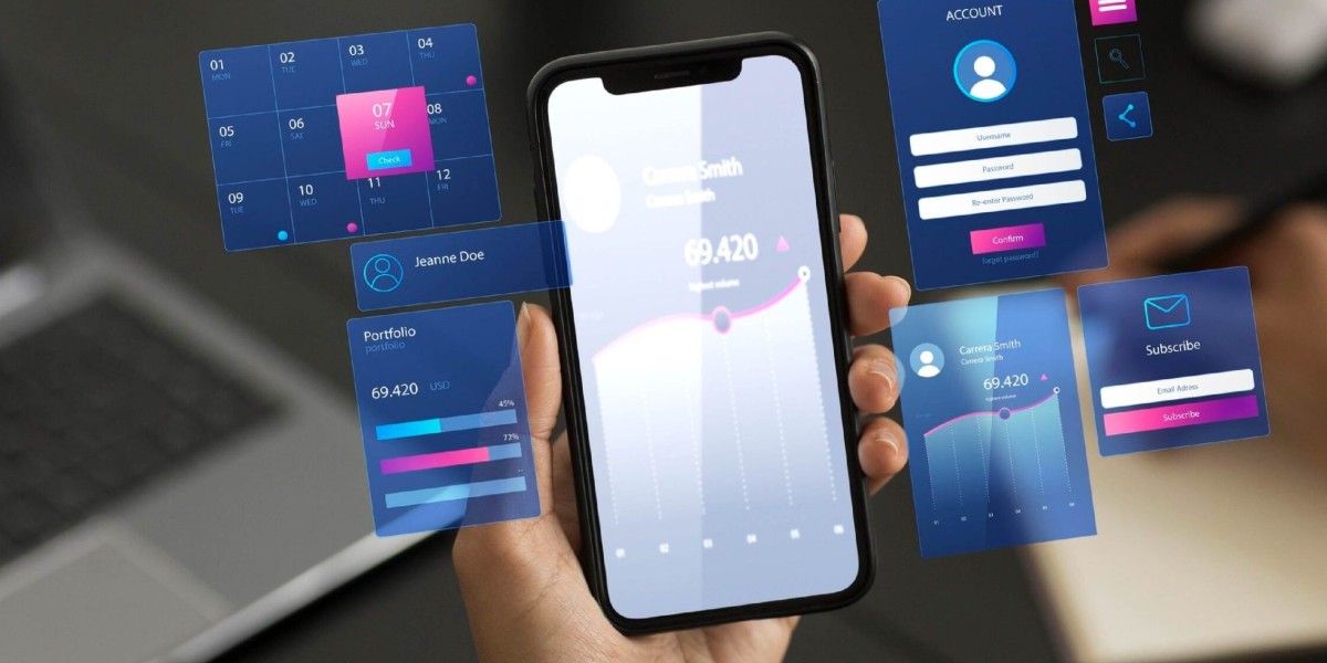
Avenga - Custom Software Development delivers expert UX/UI services that incorporate modern mobile-first design principles. Learn more at https://www.avenga.com/ui-ux/
Prioritize Content and Features for Small Screens
Mobile-first design requires careful consideration of limited screen real estate. The goal is to prioritize the most critical content and features so users can quickly access what matters most without clutter or distraction. Establish a clear, hierarchical structure where top-priority information and actions are immediately visible without excessive scrolling.
Simplify navigation by focusing on key user journeys and removing anything that does not support those core goals. Embrace minimalism to avoid overwhelming users and to ensure fast loading and responsiveness, crucial for mobile users who may have slower network connections.
Design for Touch Interactions
Unlike desktop devices, mobile devices rely primarily on fingers for input. UI elements like buttons, links, and interactive controls need to be designed with touch in mind:
Button size: Ensure tap targets are at least 48x48 pixels to prevent accidental taps and improve accessibility.
Spacing: Provide adequate spacing between clickable elements so users can easily interact without frustration.
Gestures: Support intuitive mobile gestures like swiping, pinching, and tapping to enhance navigation and content interaction.
Feedback: Use immediate visual or haptic feedback to confirm user actions and improve confidence.
Designing for touch creates a more natural and frictionless user experience on mobile devices and reduces errors.
Optimize Performance and Loading Times
Mobile users expect fast, seamless experiences regardless of their network conditions. Performance optimization is not an afterthought but a foundational part of mobile-first design:

Minimize image sizes using compression tools such as TinyPNG or Squoosh without sacrificing quality.
Use responsive images with srcset attributes to serve appropriate image resolutions for different device capabilities.
Defer non-critical scripts and lazy-load content where possible.
Avoid autoplay of videos and animations, allowing users to control media playback, which preserves bandwidth and improves overall UX.
Fast page load times help reduce bounce rates, increase user satisfaction, and are favored by search engines, improving discoverability.
Create Clear Visual Hierarchy and Scannability
Small screens require UI designers to establish clear visual hierarchy so users can easily scan and comprehend content:
Use typography strategically—legible fonts sized appropriately for reading without zooming.
Employ whitespace effectively to separate sections and guide the eye naturally.
Limit text length and break content into digestible chunks.
Highlight primary calls to action with distinct colors and placement to encourage conversions.
Good hierarchy helps users find information quickly and accomplish tasks with minimal effort.
Ensure Accessibility and Inclusivity
Accessibility is a critical aspect of UI/UX best practices, especially on mobile where device settings and user abilities vary widely:
Support adjustable text sizes without breaking layouts.
Maintain high contrast between text and background for readability.
Ensure all interactive elements are accessible via screen readers.
Provide alternative text for images and meaningful labels for controls.
Design with colorblindness and other visual impairments in mind by avoiding color-only cues.
Inclusive design expands your audience reach and complies with legal standards.
Utilize Responsive and Adaptive Layouts
Although mobile-first starts with the smallest screen, your design should adapt fluidly to all devices:
Use flexible grid systems and media queries to rearrange and resize elements across breakpoints.
Prioritize content rearrangement rather than just scaling down; sometimes different content or navigation structures are preferable on larger screens.
Maintain consistency in branding and visual language while adapting UX patterns to each device's interaction model.
This approach prevents usability issues on tablets, desktops, and other devices without duplicating effort.
Conduct User Research and Continuous Testing
User behavior and preferences vary, so continuous testing is necessary to refine mobile-first designs:
Observe users interacting with prototypes on real devices.
Collect feedback to identify pain points and usability issues specific to mobile contexts.
Use analytics tools such as heatmaps to understand how users navigate and interact.
Iterate designs based on user insights to improve efficiency, satisfaction, and conversion rates.

Rapid prototyping and iteration reduce development risks and improve final product quality.
Prioritize Security and Privacy by Design
Mobile users demand secure and trustworthy applications. Incorporate security and privacy considerations early in your UI/UX design:
Simplify authentication with options like biometric login or social sign-in to reduce friction.
Clearly communicate permissions and data usage to build trust.
Minimize input fields and avoid collecting unnecessary information to protect user privacy.
Design error states and alerts that help users understand any issues without exposing sensitive data.
Secure design helps protect users and enhances brand reputation.
Best Practices for Navigation in Mobile-First Applications
Navigation is critical in mobile apps given limited space:
Use bottom navigation bars for easy thumb access to primary sections.
Employ hamburger menus or slide-in drawers sparingly and ensure they are discoverable.
Provide clear back buttons and breadcrumbs where applicable.
Use search and filters to help users find specific content quickly.
Intuitive navigation reduces cognitive load and improves user retention.
Avenga - Custom Software Development combines expert UI/UX design with mobile-first best practices to build engaging, performant applications. Their holistic approach encompasses research, prototyping, accessibility, and adaptive design tailored to mobile users. Discover more about their UI/UX capabilities at https://www.avenga.com/ui-ux/
Creating mobile-first applications with a laser focus on content prioritization, touch optimization, performance, and accessibility leads to superior user experiences that drive engagement and business success in 2025 and beyond. Embracing these UI/UX best practices ensures your mobile product is not only functional but also delightful and inclusive for all users.