Clever Course: How I Launched a Clean, Revenue-Ready LMS Without Drowning in Plugins
My internal mandate was simple: launch a credible, mobile-first LMS that our trainers can manage without developer hand-holding. Our old stack was a patchwork of shortcodes, inconsistent lesson layouts, and three separate places to change a button label. Support tickets piled up for password resets, payment glitches, and course drip timing. I needed one theme that respected fundamentals—content hierarchy, payments that “just work,” and authoring that a busy instructor can learn in an afternoon.
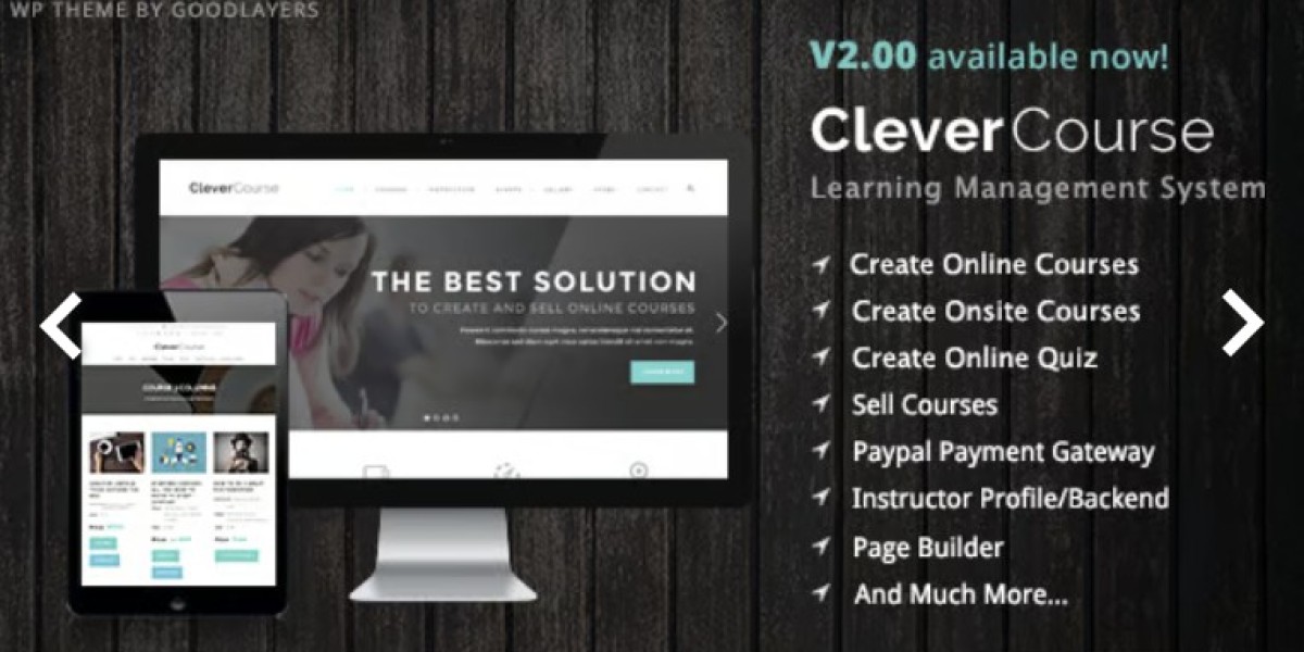
That’s why I switched to Clever Course - Education / LMS WordPress. Below is the practical field note I wish I had on day one: what I configured, what I disabled, and the patterns that actually improved enrollments.
Side note for catalog expansion later: when we spin up niche stores or add a merch flow, I keep a bookmark to broad WooCommerce Themes. For the core learning site, though, Clever Course has given me the right defaults.
The Problem I Needed to Solve (in Plain English)
Author independence: Trainers should publish a course, add lessons/quizzes, and schedule drip without tapping engineering.
Unified student journey: Landing → syllabus → preview → enroll → learn → complete → certificate, with no “now open this other tab” moments.
Mobile discipline: Most learners skim on phones; the layout must keep titles readable, controls tappable, and progress obvious.
Performance sanity: <2.5s LCP on throttled 4G, minimal layout shift, images compressed once and reused.
Payments that behave: Clear price, one cart, one thank-you, emails that match what the dashboard shows.
Clever Course gives you thoughtful course/lesson templates, a clean quiz engine, punchy progress components, and a checkout path that is easy to reason about. In short: fewer moving parts, more shipped content.
My 60-Minute Setup (The “Ship It” Checklist)
1) Theme install & demo import
I imported the “classic course” demo because it keeps the home hero tidy, surfaces a few featured courses, and drives to a single CTA. I deleted the fancy sections I knew we wouldn’t maintain (sliders, counters, and the “animated everything” strip).
2) Global style pass
Typography: 17–18px base, 1.5–1.65 line height, heading scale that keeps H2s scannable.
Color: one primary (CTA), neutral dark for text, neutral light for backgrounds.
Buttons: full-width on mobile, medium radius, visible focus states.
Motion: reduce entrance effects to simple opacity/translate; keep durations ~160ms.
3) Course content model
Course → Section → Lesson → Quiz → Assignment hierarchy, written down in a two-page doc.
Media policy: 16:9 thumb covers, WebP; video hosted via a single provider with signed URLs.
Naming rules: lessons start with verbs (“Define…”, “Identify…”, “Practice…”), quizzes use the outcome in the title (“Check: Can You Map the Funnel?”).
4) Payments & accounts
One checkout page, guest checkout allowed (with forced account creation on purchase).
Order emails rewritten in plain English; certificate emails are separate and celebratory.
Coupons limited to named campaigns; no permanent “10% off everything” coupon sprawl.
Installation & Configuration (What I Actually Clicked)
Theme Wizard
Imported minimal demo with Course Grid + Single Course.
Enabled the built-in course archive, disabled carousel blocks (heavy, low value).
Turned on “sticky learn bar” on lesson templates (progress, previous/next, and CTA).
Customizer
Site identity (SVG logo), favicon, and open-graph defaults.
Color: dark text on light backgrounds, with a contrasting CTA that meets 4.5:1 contrast.
Footer: slim—help, contact, privacy, and a tiny “How courses work” explainer.
LMS Settings
Progress mode: completion gated by lessons + quizzes.
Drip: release by day after enrollment for cohorts, by date for fixed semesters.
Prerequisites: capstone courses require 80% completion in foundation track.
Certificates: one default template with dynamic fields (name, course, date, score).
Authoring Roles
Instructors can create courses, lessons, quizzes; Editors can publish; Admins control pricing and coupons. Keeps finances tight while enabling content velocity.
The Student Journey I Optimized For
Discover: category or search brings a learner to a course landing page with a short promise, five bullet takeaways, and a 3-minute preview lesson.
Decide: syllabus shows everything up front—sections collapsed, lesson titles readable, quiz count visible.
Enroll: single checkout with price clarity (no surprise fees).
Learn: progress bar at top, lesson body with consistent media, transcript below video, next-step CTA at the end.
Check understanding: quizzes with instant feedback, plus explanations for wrong answers.
Finish: certificate generated; optional feedback form focused on actionable course improvements.
Clever Course ships sane defaults for each step, so I mostly deleted complexity rather than adding it.
Feature-by-Feature: What Actually Helped
Course Grid & Filters
The course archive matters more than you think. I cut filters to three high-signal dimensions (Level, Topic, Length), removed “sort by popularity” on mobile, and bumped card titles up one size. Net effect: fewer empty clicks, more course page views.
Syllabus Block
I turned on “expand first section” and kept the rest collapsed. Each lesson shows duration estimates. Learners preview the first lesson free; the Enroll button stays visible as they scroll.
Quiz Engine
Quizzes support single/multiple choice, true/false, and short answer. The upgrade that mattered: explanations. We wrote one-line “why” blurbs so a wrong answer teaches, not punishes. Retakes allowed with a cooldown to discourage brute force.
Assignments & Rubrics
For project courses, we added a rubric with three criteria (clarity, correctness, presentation) and a 0–3 scale. Graders click, leave one note, and the system totals. Faster grading; clearer expectations.
Certificates
We kept one tasteful certificate template. Name and date are merged at generation; we download a copy server-side for audit and let learners re-download from their dashboard.
Notifications
Fewer, better emails:
Enrollment receipt with “Start Learning” deep link.
“New section unlocked” for drip (sent at 8 a.m. learner’s timezone).
“You’re 80% there” nudge with a single CTA back to the next lesson.
We removed the rest.
Performance & Accessibility: What I Tuned
LCP: preloaded the hero font subset, used a static image under 120KB for course headers, and avoided auto-playing videos.
CLS: explicit width/height on thumbnails, no lazy-loading above the fold.
INP: minimized third-party scripts; used CSS for tabs/accordions where possible.
Media: all lesson images exported to WebP; thumbnails standardized to one aspect ratio.
Fonts: two families max, woff2 only; font-display: swap.
A11y: focus styles on all interactive elements, 44px tap targets, captioned video, transcripts by default, and reduced-motion respected.
The theme’s structure made passing these checks straightforward—most work was asset hygiene.
Authoring Workflow That Scales (So You Don’t Become the Bottleneck)
Course template (for instructors):
Hook (one paragraph promise tied to an outcome).
Who it’s for (explicitly say who should not take it).
Syllabus (3–6 sections, 3–8 lessons each).
Requirements (time, tools, prior knowledge).
Evidence (one proof metric or testimonial).
FAQ (5 real objections answered).
CTA (one button, not three).
Lesson template:
Title that sets intent (“Define…”, “Map…”, “Build…”).
6–10 minute video, then text transcript (searchable), then a single exercise.
Next step with time estimate.
Optional resource: one cheat sheet, not a folder jungle.
Quiz template:
5–7 items per lesson checkpoint.
At least two “near miss” distractors written from real student mistakes.
Explanation for each item, not just the key.
This is the cadence that keeps complexity down and completion rates up.
Payments & Pricing Patterns That Reduced Support Tickets
Single price per course (plus optional bundle offers on the catalog page).
Refund window clearly labeled on the checkout page and email receipts.
No “surprise” cross-sell during checkout: keep the path clean; upsell after completion.
Invoices match LMS access dates; students hate mismatch.
Tax handling from one source of truth—don’t let three plugins argue over VAT.
Clever Course plays nicely with a standard WooCommerce checkout, so I removed half the custom glue code our old stack used.
Data I Actually Track (and Why)
Enroll → First Lesson Start: did we communicate value or did we just win a sale?
First → Third Lesson: where do learners stall? Fix those transitions.
Quiz First Attempt Score: calibrate difficulty; we’re teaching, not gatekeeping.
Time to Certificate: how long to complete vs. expected duration; adjust drip pace.
Support Tag Frequency: surface the top three recurring issues and fix the source.
A theme can’t force good analytics, but a sensible UI makes it easier to tag events and analyze journeys. Clever Course is predictable enough that I wired event names once and reused them across courses.
Migration Notes (If You’re Coming from a Messy LMS)
Map content first: spreadsheet with course/section/lesson titles, media locations, quiz items, and certificate rules.
Move one course end-to-end as a pilot; timebox to two weeks.
Freeze old site during final copy; keep the old URL alive with 301s to new slugs.
Bulk redirect lesson slugs; nothing hurts SEO like “Not Found” for study guides people bookmarked.
Train instructors with a 40-minute video and a one-page authoring checklist.
The surprise win: instructors stopped improvising layouts because the default lesson page already reads like a well-designed chapter.
Alternatives and When They Win
Heavy cohort tooling needed? If you rely on synchronous events, breakout rooms, and graded peer review at scale, a classroom-native platform may be simpler.
Large catalog/eCommerce-first? A storefront-centric stack might be better; that’s where a broad marketplace of WooCommerce Themes can help.
Micro-learning only? A single-page pattern with episodes may be faster than a full LMS.
For most “teach a practical skill with a few hours of content and a certificate” use cases, Clever Course hits the bullseye.
Operating Principles That Kept Me Sane
One way to do each thing. One quiz type for checks, one certificate template, one announcement channel.
Assets with rules. Standard crops, compression, naming—no renegades.
Release weekly. No live tinkering; queue changes and publish together.
Accessibility over aesthetics. Clear beats cute, especially under time pressure.
Evidence over adjectives. If we say “practical,” the syllabus must prove it.
What Learners Noticed (From Feedback)
The syllabus clarity: no guesswork about the journey.
The pace: bite-sized lessons with a consistent rhythm.
The feedback: quiz explanations that feel like mini-lessons.
The certificate: one click, name spelled right, shareable.
These are small things, but credibility compounds from them.
Final Verdict
Clever Course respects the boring, important parts of online learning: readable layouts, honest navigation, predictable progress, and reliable payments. I shipped faster, my instructors write more and ask less, and students move through the material without friction. If your LMS has become a museum of plugins, start fresh on this theme, keep your rules short and visible, and let your content be the star.