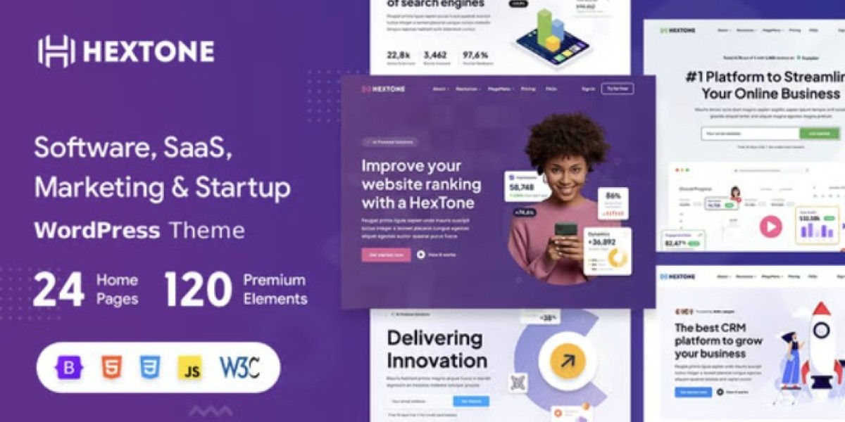
HexTone SaaS WordPress Theme: My Launch Sprint Diary
I’m going to tell this one like a launch sprint diary, because that’s exactly how it happened. Three weeks before our SaaS beta, I looked at our website and realized it was still a patchwork of half-finished pages, mismatched sections, and a homepage that didn’t explain what we actually do. I had two choices: spend days designing a landing system from scratch, or start with a strong theme and invest my time where it matters—copy, conversions, and clarity. I went with HexTone - Software, SaaS & Startup WordPress Theme, and this is a practical, no-fluff account of what that decision changed for me as the admin responsible for getting us live on time.
This isn’t a “top ten features” list. It’s an after-action report from the dashboard trenches: what I set up first, what I ignored, what surprised me, and how I shaped HexTone into a site that looks like a real product company rather than a demo page someone forgot to customize.
Day 0: The problem wasn’t design, it was narrative
Before I even touched the new theme, I wrote down our real website problem in one sentence:
Our old site showed sections but didn’t tell a story.
The homepage had a hero, some icons, a random testimonial slider, and a pricing block copied from another project. It wasn’t ugly. It was just empty of meaning. People landing on it would ask three questions and bounce:
What does this product actually do?
Who is it for?
Why should I trust it enough to try?
I didn’t need a theme that just looks “techy.” I needed a theme that supports a SaaS narrative: problem → solution → proof → action.
HexTone’s demos looked like they were built around that flow. That’s what sold me.
Day 1: Install, demo import, and the “delete ruthlessly” phase
I spun up a staging copy and installed HexTone. I always import a demo first, not because I plan to keep it, but because it reveals the theme’s logic.
Once the demo was in, I did a ruthless first pass:
Deleted entire sections we’ll never use (like niche portfolio areas).
Removed placeholder CTA buttons that didn’t fit our funnel.
Simplified the menu to only the essential routes we need for beta.
This is an underrated step. A theme can be perfect, and you can still ruin it by keeping every section just because it’s there. HexTone is generous with layouts, so my job was to narrow it into a clean product story.
By the end of Day 1, the staging site already looked like a credible SaaS homepage—just with fake text.
Day 2: Setting the funnel before styling anything
Most people style first and funnel later. I forced myself to do it the other way around.
I mapped the user journey like this:
Homepage: convince a cold visitor to explore features or pricing.
Features page: explain capabilities in a structured, skimmable way.
Pricing page: remove anxiety, show tier logic clearly, push trial/signup.
Docs/Resources: lightweight for now, but should exist to build trust.
Contact/Support: reduce friction for sales or onboarding questions.
HexTone already ships with templates aligned to these routes, so I assigned each page a purpose rather than a design. That clarity made the rest easy.
Day 3: Homepage rebuild as a product pitch, not a collage
I rebuilt the homepage from top to bottom with one rule: every section must answer a specific user doubt.
Hero: one sentence, one action
HexTone’s hero layouts are bold but not noisy. I kept the structure and changed only:
Headline → replaced with a single “this is what we do” line.
Subheadline → clarified audience and outcome.
Primary CTA → one action only, no extra button clutter.
The theme’s spacing made the hero feel confident even with minimal text.
Problem block: make the pain visible
Instead of jumping straight into “features,” I used a HexTone section meant for highlights to frame the problem.
Three short pain points.
No jargon.
Written like a user complaint.
This anchored the rest of the page in real needs.
Solution block: show the product in motion
HexTone’s product showcase sections are clean, with space for screenshots and short explanations. I paired each screenshot with:
A one-line benefit.
A short “how it works” sentence.
No long paragraphs. SaaS buyers scan first.
Proof block: credibility without bragging
I used a testimonial + metrics layout but kept it restrained:
One strong testimonial.
Two small metric cards (useful numbers only, not vanity).
HexTone makes this kind of quiet proof feel natural.
Pricing teaser: not full pricing, just direction
I didn’t want pricing to dominate the homepage, so I used a compact starter pricing section with a button to the full page. The theme’s pricing block styling was already polished, so it didn’t need much work.
By the end of Day 3, the homepage felt like a real pitch deck turned into a website.
Day 4: Feature pages that don’t feel like a list
Feature pages are where SaaS sites often fail. They either dump 30 bullet points or write marketing poetry that says nothing.
HexTone has multiple feature layout patterns, and I used them like building blocks:
Core features grid
Six features max.
Each one has a short benefit label and a screenshot snippet.
Workflow sections
A “step-by-step” layout built into the theme.
I used it to show how a user goes from onboarding to outcome.
Edge-case features
Smaller accordion blocks for advanced capabilities.
Keeps the page clean while still serving power users.
The key benefit was consistency. Every feature block looked like it belonged to the same product, because HexTone uses a unified visual language across layouts.
Day 5: Pricing page—where I usually lose my mind
Pricing pages are high-stakes. Confusing pricing kills trials.
HexTone’s pricing templates are practical:
Clear tier cards.
Space for short feature checklists.
Visual emphasis options without becoming tacky.
Here’s how I approached it:
Picked the “middle plan” as the default highlight.
Kept each tier’s bullet list to the top differentiators only.
Added a soft “FAQ under pricing” section to answer objections.
I also used a comparison strip lower on the page, but only for three dimensions:
Ideal user type.
Limits/scale.
Priority support.
Anything more becomes noise.
HexTone didn’t force a pricing aesthetic; it gave me structure and let me decide the tone.
Day 6: Branding and colors—minimal changes, max coherence
Only after the funnel and pages were solid did I touch design tokens.
I set:
Primary color
Neutral background shades
Heading/body font choices
Button style
HexTone responded well to small brand changes because its defaults are already modern. I didn’t need to rewrite CSS or fight weird color overrides. It felt like the theme expected admins to brand it quickly.
This was a big difference from some broader Multipurpose Themes I’ve used before, where branding can feel like whack-a-mole across ten different option panels.
Day 7: Mobile pass—fixing what users actually see
Our analytics say most first-touch visitors come from mobile social or email. So I did a purely mobile walkthrough:
Hero legibility
CTA thumb reach
Feature grid collapse behavior
Pricing card readability
HexTone’s responsive behavior was solid out of the box. Still, I did a few admin-level refinements:
Shortened some headings for small screens.
Reduced overly tall hero padding.
Adjusted a couple section orders so “what we do” appears sooner on mobile.
Nothing major. No custom scripts. The theme handled the hard part.
Week 2: The “real content” stress test
A theme can look great with demo text and fall apart with real content. Week 2 was when I poured in reality:
Real product screenshots (not perfectly uniform).
Real copy written by the team (sometimes too long).
Real testimonials (varied length and tone).
Real use-case pages.
HexTone passed the stress test for two reasons:
Layouts are forgiving
Longer headlines didn’t break the grid. Taller screenshots didn’t ruin spacing.Visual rhythm stays stable
Even when content varied, headers, body text, and cards kept a consistent cadence.
That meant I could focus on editing copy for clarity, not for layout survival.
Week 2, Day 3: Speed and stability tuning
Even a good theme can become sluggish if the site admin gets sloppy with assets. I did a speed pass with three rules:
Export screenshots in web-friendly sizes.
Avoid unnecessary background video sections.
Keep animation subtle and rare.
HexTone doesn’t overload pages with heavy motion by default. That matters. Some SaaS themes try to impress with constant animation and end up punishing performance.
After standard optimization, the site felt fast and stable, especially on mobile.
Week 2, Day 5: Building trust for a startup that’s still new
We’re a growing product. We can’t lean on huge brand recognition. So trust blocks matter.
HexTone includes templates for:
Team profiles
Roadmap/Timeline sections
Partner/sponsor strips
Customer voice blocks
I used a combination of these to create a lightweight “Why trust us” segment:
A short “Our approach” section, written plainly.
Three team cards showing real roles and faces.
A small “security and reliability” list.
Kept it human, not corporate. HexTone’s style supported that tone.
Week 3: The maintainability check
Here’s something I do before any launch: I ask whether the site will be easy to maintain when I’m busy and stressed.
So I tested most common tasks:
Swap homepage hero for a new campaign
Add a new feature block
Publish a new use-case page
Update pricing values
Replace screenshots without re-aligning everything
HexTone made these tasks predictable. Once you understand its pattern system, changes feel like re-arranging a toolkit rather than dismantling a machine.
That matters long after the excitement of launch fades.
What surprised me the most about HexTone
A few things I didn’t expect:
The theme supports restraint
It’s easy to create a clean SaaS site without adding noise. Some themes force you into maximalism.It scales from “beta landing” to “full product site”
I can add docs, integrations, and deeper feature hubs later without re-theming.Design stays modern even with minimal edits
Small branding changes are enough to make it feel custom.
These are practical surprises, not marketing ones.
Mistakes I avoided (because the theme nudged me away)
Sometimes a theme’s structure saves you from your worst habits.
HexTone helped me avoid:
Over-sectioning the homepage
Because its demo structure is already paced well.Feature dumping
Because it provides multiple feature layouts that encourage hierarchy.Aggressive CTA spam
Because its CTA blocks look best when used selectively.
A good theme doesn’t just give you tools; it nudges you toward good judgment.
Who I think HexTone is best for
Based on this build, I’d recommend HexTone to:
SaaS startups needing a credible site fast
Software products with multi-feature narratives
Agencies building product sites for clients who want modern style without custom dev
Admins who don’t want to live inside CSS files
It’s especially strong if your product story needs both clarity and polish.
When I might choose something else
To be fair, HexTone isn’t for every scenario.
I might not use it if:
The product is extremely minimal and needs a one-page microsite only
The brand is intentionally playful or non-tech (HexTone reads modern-tech)
You want a radically experimental layout from day one
But for the mainstream SaaS + startup world, it fits naturally.
My personal checklist for using HexTone again
If I ran another SaaS homepage sprint with HexTone, I’d follow the same order:
Demo import in staging
Delete ruthlessly
Funnel map first
Homepage story build
Feature hierarchy
Pricing clarity
Branding pass
Mobile scan
Real content stress test
Maintainability check
HexTone supports this workflow beautifully because it’s modular without being chaotic.
Closing thoughts
Websites for software products fail for simple reasons: they don’t explain the product quickly, they overwhelm visitors with noise, or they turn updating into a pain. HexTone didn’t magically solve everything—but it removed friction from the parts that usually drain my time as an admin.
It gave me a clean SaaS narrative scaffold, modern layouts I could trust, and enough flexibility to keep growing past the beta stage. Most importantly, it let me spend the sprint on things that actually move the needle—copy, clarity, and conversion paths—instead of wrestling with layout issues.
If you’re staring at a half-built SaaS site with a launch deadline looming, a theme like HexTone can be the difference between shipping a real product presence and shipping a placeholder. For me, it turned a stressful three-week scramble into a structured build I can maintain long after the launch confetti settles.