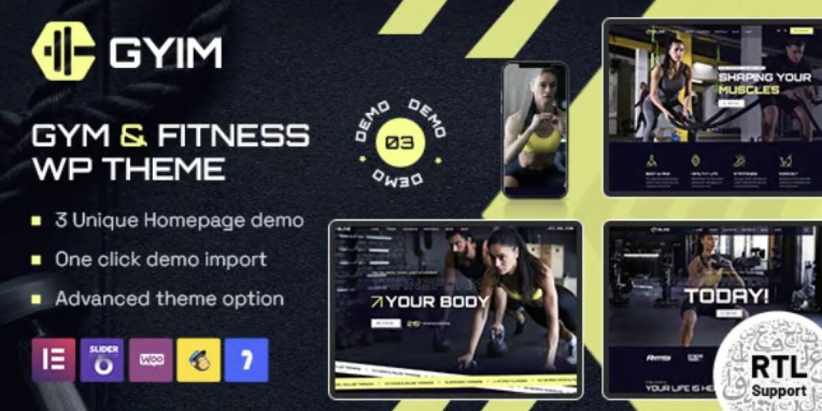
Gyim Gym and Fitness WordPress Theme: My Studio Rebuild Log
I’m going to frame this one as a rebuild log, because that’s how I actually experienced it—step by step, under real pressure. Our gym’s old site was the online equivalent of a dusty storage room: everything technically existed, but nothing felt easy to find, and nothing made a visitor want to take action. So I rebuilt it around Gyim - Gym and Fitness WordPress Theme, and this post is my honest site-admin account of what changed and why. If you’re running a gym, a fitness studio, a bootcamp program, or even a small PT brand, you’ll probably recognize a lot of the same problems I was trying to fix.
I’m not a full-time designer. I’m the person who keeps the website aligned with reality—class times, trainer bios, membership offers, seasonal campaigns, and “please update the schedule today because it changed again.” That role is half technical, half operational, and usually full of last-minute requests. So what I care about most in a theme is not just looks, but whether it supports a fitness business workflow without turning every change into a mini-project.
The “quiet failure” of our old gym website
Fitness websites don’t usually fail in dramatic ways. They fail quietly:
Visitors don’t understand what programs you run.
Schedules are hard to read.
Mobile users can’t find the “Join Now” path.
The site looks stale, so people assume the gym is stale.
That’s exactly where we were. The site wasn’t broken, but it wasn’t pulling its weight. Think of how people browse gym sites in real life. They’re often:
On their phone, maybe between tasks.
Comparing two or three local gyms.
Looking for a quick answer: price, location, vibe, schedule, trainers.
Our old homepage opened with a generic hero slider, then slammed visitors with a wall of text. The class timetable was a PDF. Trainer bios were a dead-end list. On mobile, the menu was a maze. There was no narrative and no funnel.
Internally, it created friction too. Our front desk staff would constantly tell me:
“People keep calling asking about class times, even though it’s on the website.”
“They say they can’t find membership options.”
“They ask if the gym is still open because the site looks old.”
That’s a painful sentence to hear as an admin: “the site makes us look closed.”
So instead of patching another layout, I decided to rebuild from scratch with a theme designed for gyms and fitness programs.
What I needed from a fitness theme (my real checklist)
Before picking Gyim, I wrote a brutally practical checklist. If a theme didn’t support these needs, I wouldn’t use it:
A homepage that sells the experience
Not just a list of services. A real sense of vibe: strength training, group energy, coaching, recovery, community.A schedule system that’s actually readable
People should find today’s classes in 10 seconds, not 10 clicks.Trainer profiles that feel human and credible
Fitness is trust-based. People want to know who’s coaching them.Clear membership and pricing flow
Even if you don’t show full pricing publicly, you need a structured funnel that leads to inquiry or sign-up.Conversion-friendly CTAs without being pushy
“Book a trial,” “Join now,” “Talk to a coach” should be easy to reach.Mobile first, always
Most gym browsing happens on mobile. If the theme isn’t great on phones, it’s dead on arrival.
Gyim hit these points on paper. The real test was whether it would work once I poured in our messy real-world content.
First install: why Gyim felt like fitness marketing, not generic web design
I installed Gyim on a staging site and imported one of its demos. Within minutes, two things were clear:
The theme “thinks like a gym.”
The layouts prioritize classes, trainers, transformations, and calls to action in the right order. It’s not a business template pretending to be fitness.The design language is energetic without being chaotic.
Fitness sites need momentum, but too many themes confuse “energy” with “noise.” Gyim stays clean while still feeling active.
I spent the first hour just exploring the demo pages and templates:
Home variants (strength-focused, studio-friendly, bootcamp-style).
Class lists and timetables.
Trainer profiles.
Pricing/membership blocks.
Testimonials and “before/after” style highlight sections.
Instead of thinking, “How do I bend this into a gym site?” I was thinking, “Which gym model do we want to emphasize?”
That’s the best kind of theme experience.
Rebuilding the homepage as a “walkthrough tour”
Our gym isn’t just a room with equipment; it’s an experience. So I built the homepage like a guided tour:
1. Hero section: one clear message, one primal CTA
Gyim’s hero layouts are strong. I kept the structure and replaced the text with something honest:
Who we are (gym / studio + core promise).
Who we’re for (beginners, lifters, group training lovers, etc.).
One primary action: Book a free trial (or whatever your top funnel is).
By not adding multiple competing buttons, the hero felt more confident. Gyim’s typography and spacing made that work with minimal tweaks.
2. Program highlights: what we offer in plain language
Instead of listing every class, I grouped them into three program buckets:
Strength & conditioning
Group classes
Personal coaching
Each bucket got:
A short benefit headline.
A one-sentence explanation.
A “learn more” CTA tied to the relevant page.
Gyim’s service blocks made it easy to keep these crisp and scannable.
3. Social proof: calm but clear
I used one of Gyim’s testimonial sections, but I trimmed it to:
Two short testimonials from different types of members.
One small metric strip (years running, members trained, or class count).
Fitness trust grows from specificity, not volume. Gyim’s layout lets proof sit visibly without drowning the page.
4. Mini schedule preview
Right below proof I added a small “Today / This Week” schedule preview. This is the highest-intent content for many visitors. If they don’t see what’s happening soon, they bounce.
Gyim’s timetable styles are clean, giving class names and times enough space to be readable on phones.
5. Coach spotlight
We lead with coaching, not machines. So I added a coach spotlight block:
One featured head coach card.
Two supporting trainer cards.
Links to the full trainer page.
Gyim’s trainer card styling is modern and consistent, so this didn’t feel like a random add-on.
6. The “next step” CTA
At the bottom of the homepage I inserted a calm CTA band:
One sentence about trying the gym.
One button to book or inquire.
Optional secondary phone/contact line.
Gyim gives you this kind of CTA block on purpose—fitness businesses need repeated but gentle nudges.
By the end, the homepage felt like a real first visit. If you scroll it, you understand the gym before you ever set foot inside.
Class and schedule pages: where fitness sites win or lose
If I had to name the single most important functional page on a gym site, it’s the schedule.
Our old schedule was a PDF. The new schedule needed to be:
Easy to scan
Easy to update
Responsive on mobile
Grouped sensibly by program
Gyim’s schedule templates helped me build exactly that.
How I structured our timetable
I separated the timetable into:
Strength/conditioning sessions
Group classes (HIIT, mobility, core, etc.)
Specialty sessions (yoga, recovery, seminars)
On the page, I used Gyim’s tabbed/section layouts so visitors can filter quickly without scrolling forever.
One trick that worked well:
I used short, “human” class names in the visible schedule, then expanded details in the class page itself. That keeps the timetable clean, while still giving detail when someone clicks in.
Admin reality: last-minute changes
The real test was editing.
Two weeks after launch, a coach had to swap Wednesday’s class time. Old site: edit PDF, export, upload, relink. New site: change one time field, update, done. The layout stayed intact.
That admin-side simplicity is a huge deal. A theme that makes schedule updates easy is worth more than any fancy animation.
Program pages: turning offerings into journeys
Gyim isn’t just a class list theme; it supports program storytelling. I built separate program pages for:
Beginner strength path
Fat-loss bootcamp track
Hypertrophy coaching
Mobility and recovery classes
Each program page followed a consistent structure:
Who it’s for
What happens in a typical session
Expected outcomes in 6–12 weeks
Coach lead + expertise
Next step CTA
Gyim’s layout blocks are flexible enough to maintain this structure without feeling repetitive. Consistency helps readers compare programs without confusion.
Trainer profiles: making coaches feel like real people
Fitness is personal. People often choose a gym because they believe in the coaches.
Gyim’s trainer templates give you:
Strong photo placement
Space for a real bio
Areas for certifications and specialties
Optional social/contacts (I kept these minimal)
I wrote each trainer bio with three ingredients:
Story — how they got into training
Expertise — their coaching focus and qualifications
Personality — a line that makes them human
Then I tied trainers to programs and classes so visitors see continuity:
“This is Coach Maya. She runs strength basics on Tuesdays and mobility workshops monthly.” That kind of clarity turns browsing into trust.
From an admin standpoint, it’s also easy to maintain. If a trainer adds a new certification or shifts their focus, I edit one profile and the changes flow everywhere that trainer appears.
Membership and pricing: clarity without oversharing
Not every gym wants pricing fully public. We do show ranges and plans, but still encourage a trial or consultation.
Gyim’s pricing blocks made this clean:
Each plan has a card
Bullet highlights are readable
Buttons feel equally weighted without chaos
I structured our membership section like this:
Starter plan — best for beginners
Unlimited classes — for group-training fans
Coaching plan — for transformation-focused members
Each plan contains:
Who it’s best for
What’s included
One clear CTA (trial, inquiry, or join)
Under the pricing cards I placed:
A short FAQ about cancellation, freezes, and trial rules
A calm “Talk to us” CTA for anyone unsure
This combination reduces anxiety. The theme supports it without needing custom design work.
The visual side: energy, but controlled
Gyms have a temptation to go loud: neon highlights, endless carousels, animated counters, busy backdrops. That can work for some brands, but it can also cheapen trust.
Gyim gives you energy through:
Strong headline styles
Modern grid rhythm
Fitness-appropriate iconography
Bold hero treatments
But it doesn’t force overload. I kept visual discipline by:
Using one primary brand accent color
Limiting animations to a few subtle elements
Keeping backgrounds clean behind text
Standardizing image tones (we did a mini photoshoot for this)
The result is a fitness site that looks active, not frantic.
Mobile pass: what I checked and why it mattered
I always do a full mobile walkthrough before launching. Here’s what I checked:
Hero readability without zooming
CTA button size and thumb reach
Schedule scanability
Trainer cards stacking behavior
Pricing card legibility
Page load feel on cellular
Gyim behaved well out of the box. Still, I adjusted a few things:
Shortened a couple headings that wrapped awkwardly on small screens
Moved the schedule preview higher on mobile
Reduced one overly tall image block
No custom scripts. Just admin-level ordering and copy tuning.
Performance and SEO: the practical fitness version
Fitness sites are image heavy. If you upload 15MB photos directly from a phone, no theme can save you.
So I followed a few rules:
Export images in web-friendly size before upload
Use lazy loading for lower sections
Avoid background videos unless they serve a clear purpose
Keep “countdown or timer” widgets minimal
Gyim’s codebase didn’t feel bloated. The pages stayed stable after standard optimization, and on mobile the site feels quick.
From an SEO perspective, the theme also supports logical structure:
Clean headings
Clear page hierarchy (Home → Programs → Classes → Trainers → Pricing)
Templates that don’t bury content under visuals
I paired that with natural copy (not keyword stuffing) and proper schema where relevant.
Comparing Gyim to more general themes I’ve used
I’ve built small fitness pages on broader themes before, including some solid Multipurpose Themes. They’re flexible, sure, but fitness sites need more than flexibility:
Timetables
Trainer presentation
Program funnels
Transformation proof layouts
Strong CTA rhythm
With multipurpose templates, I always ended up building those patterns manually. With Gyim, those patterns were already native to the theme.
That reduced build time and long-term maintenance. I didn’t have to invent a schedule style; I picked one and tuned it. I didn’t have to fake a trainer system; it exists. That difference compounds every week you maintain the site.
Real-world effects after launch
The best compliment I got wasn’t “nice design.” It was operational:
Fewer calls asking about schedule
More trial bookings from mobile
Coaches sending their profile pages to prospects confidently
Members sharing the new site on social without me asking
Analytics supported it too:
Homepage bounce rate dropped
More users clicked into program pages
Trial CTA clicks increased
Mobile session time went up
A theme doesn’t create success alone, but it can remove friction in the experience. Gyim removed a lot.
What I’d do differently next time
No rebuild is perfect. If I started over again with Gyim, I’d improve a few process things:
Define photo standards earlier so every new shoot matches the brand tone
Create a monthly schedule update workflow with coaches to avoid last-minute chaos
Add more transformation stories as the archive grows
Build a small “Start Here” guide for beginners right on the homepage
But the theme choice itself? I’d repeat it. Gyim gave me the right foundation.
Who Gyim is best for (from an admin’s seat)
After living with Gyim in real use, I’d say it’s ideal for:
Gyms with multiple programs and a weekly class schedule
Fitness studios (HIIT, yoga, barre, functional fitness)
Bootcamp or transformation-focused brands
Personal trainers who want a studio-level presentation
Site admins who need to update schedules and offers often
It might be less ideal if:
You only need a one-page brochure site
Your gym doesn’t run structured classes at all
You want an ultra-minimal “landing only” presence
But for most real fitness businesses that juggle classes, coaches, and memberships, the theme fits naturally.
Closing thoughts
Gym websites aren’t about showing off design tricks. They’re about making someone feel confident enough to take the first step—book a trial, show up to a class, trust a coach. That requires clarity, energy, and reliability behind the scenes.
Using Gyim as the foundation, I got:
A homepage that sells the gym experience without yelling
Schedules that are readable and easy to update
Trainer profiles that build trust
Program pages that guide visitors toward the right path
Pricing sections that clarify decisions
A mobile-first flow that matches how people browse fitness sites today
And as the admin, I got something equally important: a site that doesn’t fight me every time reality changes.
If your current gym site feels like a quiet liability—technically there, but not doing much—rebuilding on a fitness-native theme like Gyim can turn it into a real growth asset. That was my experience, and I’m glad I stopped patching and started fresh.