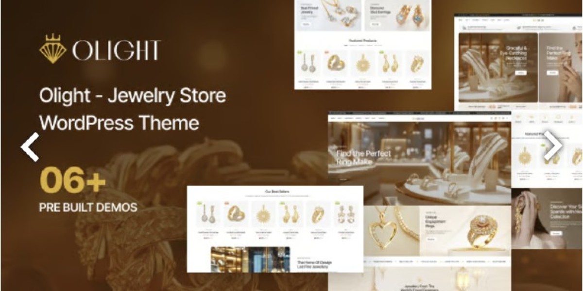
Under the Hood of Olight: A Clean WooCommerce Jewelry Build
I’m going to open with a tiny horror story—because every jewelry store website has one.
A client asked me to “just swap the hero banner” for a Valentine’s campaign. Simple, right? Except the new banner pushed the product grid down, the header overlap looked fine on my laptop but hid the menu on iPhone, and the product gallery started loading in a way that made rings look like blurry blobs for the first two seconds. Jewelry customers don’t forgive that. When you’re selling something emotional and high-intent, visual trust is the conversion engine.
So I did what I always do when a site starts feeling like a fragile demo: I rebuilt the store around Olight - Jewelry Store WordPress Theme and approached it like a plugin developer. Not “does it sparkle,” but “does it behave like a reliable system?” That means: predictable templates, reusable components, performance budgets for imagery, update-safe customization, and a WooCommerce workflow that doesn’t break the second an admin adds 50 new SKUs.
This post is for website admins—store owners, marketers, and the brave person who maintains the WordPress stack—who want to understand what matters under the hood. I’m writing in first person because this is exactly how I build: part diary, part teardown, part “here’s the checklist that prevents 2 a.m. emergencies.”
Why jewelry stores are harder than most eCommerce sites
People assume jewelry stores are “simple eCommerce.” In reality, they’re more demanding than many categories because jewelry is high-scrutiny commerce:
Customers zoom in on images and notice compression artifacts.
Price perception depends on typography and spacing (seriously).
Variants matter: size, metal, stone, engraving.
Product pages need trust layers: shipping, returns, authenticity, care instructions.
Collections are curated (not just “categories”).
Campaign pages rotate frequently (seasonal, gifting, limited editions).
Performance matters because users browse on mobile while comparing options.
The biggest theme failure mode in jewelry is this: it looks premium in the demo, but it becomes messy once products are real—real photos, real variants, real filters, real plugins.
So my evaluation criteria for a jewelry theme isn’t “is it elegant.” It’s:
Can it keep product imagery crisp and fast?
Can I build repeatable product information blocks without copy/paste debt?
Can non-technical admins maintain collections and campaigns safely?
Can I customize without editing parent theme files?
Can it stay stable once WooCommerce extensions and tracking scripts are added?
The plugin mindset: treat the theme as a UI layer
When I develop plugins, I always separate:
data layer
rendering layer
integration points
update safety
A WooCommerce theme should be treated the same way:
WooCommerce + product data = the truth
Theme templates = how the truth is displayed
Extensions/plugins = behaviors (filters, wishlists, emails, checkout tweaks)
Child theme = safe customization zone
If you let the parent theme become the “brain,” updates become scary. If you keep logic and customization separated, updates become routine.
That’s why I build with a simple rule: no direct edits to the parent theme. Ever.
Step 1: Start from the product page (not the homepage)
This is the number-one admin mistake: polishing the homepage while the product page is mediocre.
In jewelry, the product page is where trust either forms or collapses. So I started with these priorities:
Product gallery is clean and fast
Variant selection is obvious
Price + value messaging is readable and consistent
Shipping/returns/trust blocks are present but not cluttered
Add-to-cart is clear and reliable on mobile
Once the product page is strong, the rest of the site becomes easier. The homepage becomes a curated entry point, not a fragile masterpiece.
Step 2: Product imagery as a “performance budget”
Jewelry sites live on images, but images are also the biggest performance risk.
So I treat images like code dependencies:
Rules I enforce
Consistent aspect ratios for product thumbnails (prevents layout jump)
Transparent background images used carefully (avoid heavy files)
Gallery images optimized for zoom without being gigantic
Lazy-load below-the-fold visuals
Avoid loading every gallery thumbnail at once on mobile
Why admins should care
If images are unmanaged, every new product makes the site slower. Over time, the store “rots.” Customers feel the rot as hesitation: slow scroll, blurry thumbnails, delayed zoom, flickering layout.
A theme like Olight makes it easier to keep things visually elegant—but admins still need discipline. Elegant design + heavy images = premium-looking slow store, which is still a loss.
Step 3: Variants and attributes (the hidden complexity)
Jewelry variants are not like t-shirt variants. They can be emotionally important:
ring size
metal type (silver/gold/rose gold)
stone type
engraving text
bundling options (gift box, warranty, cleaning kit)
From a “developer-first” perspective, variants are state management. The theme must keep these synchronized:
chosen attributes → selected variation
price updates correctly per variation
availability messaging updates
image changes reflect variation (if configured)
add-to-cart remains stable
The biggest admin risk is mixing too many systems:
theme handles variation UI one way
a plugin tries to replace it another way
another plugin injects extra fields (engraving)
…and then the page becomes unpredictable.
My rule is “one brain”: pick the theme’s variation UI as the primary, then add extensions only when necessary, and test carefully.
Step 4: Build reusable “trust blocks” like components
Jewelry customers want reassurance, but you don’t want to turn your product page into a wall of badges.
So I build trust content as reusable blocks:
Shipping & delivery (standardized)
Returns & exchanges (standardized)
Care instructions (standardized)
Materials authenticity / certificates (standardized)
Gift packaging note (optional)
“Need help?” mini CTA (standardized)
The goal: the same structure appears on every product page without copy/paste.
This is plugin thinking: write once, reuse everywhere.
Admin benefit: when policy changes, you update one block, not 80 products.
Step 5: Collections that behave like “curated sets,” not junk drawers
Jewelry collections are storytelling:
“Minimal Gold”
“Bridal”
“Everyday Silver”
“Gifts Under $100”
“Limited Edition”
If collections are just categories, your store feels generic. Olight’s style works best when you treat collections as curated landing pages:
consistent hero style
short editorial intro (not keyword stuffing)
featured products grid
filterable section (if needed)
a “complete the look” section (optional)
Admins can keep pages consistent by using a section blueprint and duplicating it for new campaigns instead of improvising layouts.
Step 6: Checkout and cart: keep it boring (boring converts)
A jewelry store checkout should feel calm and reliable. The mistake is adding too many “enhancement” plugins:
multiple cart widgets
popups
floating buttons
upsell overlays
conflicting tracking scripts
From an ops perspective, checkout must be predictable:
payment options function
discounts work
shipping calculations are correct
confirmation emails deliver
mobile doesn’t break
If you’re choosing extensions for checkout, shipping, or conversion tools, browsing a curated set of WooCommerce Plugins can save time versus random plugin hunting—but don’t treat it like a buffet. Install only what supports a specific operational goal, and test after every change.
Step 7: Update-safe customization (child theme discipline)
This is the part that prevents long-term pain.
My setup:
child theme active from day one
all CSS tweaks in a controlled stylesheet
small functions tweaks in child theme functions or a tiny site plugin
no edits inside the parent theme folder
a simple changelog note (“what changed, why, what to test”)
When updates arrive, I can update confidently. When something breaks, I can debug quickly because changes are centralized.
Admins underestimate how much time this saves.
Step 8: Performance checklist (jewelry edition)
Here’s the practical checklist I use:
Homepage hero image not oversized for mobile
Product images properly sized and compressed
Only necessary scripts loaded site-wide
No heavy sliders above the fold unless absolutely necessary
Product page gallery loads smoothly on mid-range phones
Caching enabled for public pages (excluding cart/checkout/account)
Minimal third-party embeds (each embed is a performance tax)
A jewelry store doesn’t need a “busy” interface. It needs a fast, confident interface.
Step 9: Admin governance (how I stop “small edits” from breaking the vibe)
Most jewelry stores have multiple hands editing the site:
owner changes pricing text
marketer swaps banners
staff member uploads new product photos
someone updates shipping policy
Without rules, the design drifts.
So I define “safe edits” vs “review required”:
Safe edits
product titles/descriptions
image uploads using defined dimensions and aspect ratios
collection assignments
homepage copy inside approved sections
Review required
global typography settings
header/menu layout
product template section structure
checkout/cart behavior plugins
This prevents the classic “why is the font different on every page?” scenario.
My launch checklist (the “gift shopper stress test”)
Before I consider a jewelry store ready, I test:
Mobile navigation is flawless
Product zoom feels smooth
Variation selection is clear
Add-to-cart works reliably
Cart and checkout don’t show layout shifts
Key trust info visible without scrolling forever
Emails deliver (order confirmation, shipping updates if configured)
Page speed feels good on a normal phone connection
Backup and basic monitoring exist
If your store passes the “gift shopper stress test,” you’re in a good place—because gift shoppers are impatient, emotional, and comparison-driven.
Closing: why Olight felt like a solid base
The reason I liked building with Olight - Jewelry Store WordPress Theme wasn’t just aesthetics. It’s that it supports the kind of disciplined, plugin-like approach that makes eCommerce stable:
repeatable layouts rather than copy/paste debt
strong product page structure
design consistency that survives frequent edits
a workflow where admins can move fast without breaking the look
a foundation that can integrate WooCommerce extensions without becoming fragile
Jewelry stores don’t win by being loud. They win by being clear, elegant, and trustworthy—while staying fast and stable under real operational pressure.
If you build your store like software—modular pieces, predictable templates, update-safe customization—then your campaigns become easier, your maintenance becomes calmer, and your storefront feels premium in the way that actually matters: it works smoothly every day.