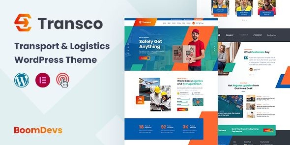
The Transco Review: A Logistics Website That Finally Moves Like Freight
I’ll start with the moment that pushed me over the edge. Our small logistics team had just lost a lead because the prospect “couldn’t figure out how to request an LTL quote” on our old site. The call came in while I was juggling rate sheets and a driver ETA. That night I decided to rebuild from the axle up. I chose Transco because I wanted a website that behaves like a disciplined dispatch desk: clear priorities, fast handoffs, minimal friction. For this review I worked with the exact theme here—Transco – Transport and Logistics WordPress Theme—and spent two weeks running it through real tasks: quote requests, service explanations, tracking updates, and recruiting. Everything below is from that lived test.
My Brief: Ship Clarity, Not Just Pixels
Logistics websites fail for familiar reasons. Too many sliders that look like airline ads. Forms that ask for your childhood nickname before giving a ballpark rate. Pages arranged by internal departments rather than customer intent. With Transco I wrote one line on a sticky note and kept it stuck to my monitor: “Make it effortless to (1) understand services, (2) request a quote, (3) track a shipment, and (4) contact a human.”
Transco’s promise is a sober design system for carriers, 3PLs, last-mile ops, and freight brokers. It ships with the blocks I hoped for—service cards, tariff-like tables, timeline/step components, FAQ accordions, and clear CTAs—without the ornamental weight that kills performance. That was enough for me to test it in production.
Setup Diary (Day 1): An Install That Didn’t Eat My Weekend
Installed the theme, added a child theme, ran the demo import. Menus, headers, and footers landed correctly.
Typography arrived sensible out of the box. I bumped body size one step for laptop comfort, tightened H1 slightly, and kept a single accent color that matches our truck livery.
The demo layout read like an ops-minded site already: hero + service grid, a “Request a Quote” rail, industries served, company stats, testimonials, and a contact footer. No mystery shortcodes, no ten-plugin circus.
By lunch, I had a working skeleton. The rest of the day went into writing, not wrestling, which is a rare and welcome inversion.
The Hero and Above-the-Fold Discipline
Transco’s hero block gently forces good behavior: one headline, one subhead, one primary action. I wrote:
“On-time freight, transparent rates.”
We handle LTL, FTL, drayage, and last-mile with live updates and honest ETAs.
Primary CTA: Get a Quote. Secondary link (not a button): Track a Shipment. The spacing and typographic contrast made the order of operations obvious. Visitors shouldn’t need a map to find the obvious. Here, they don’t.
Information Architecture: Built Around Real Tasks
This is where Transco won me over. The service directory is verb-first, not org-chart-first:
Request an LTL Quote
Book Full Truckload (FTL)
Schedule Last-Mile Delivery
Port & Drayage Services
Warehousing & Cross-Dock
Expedited & Hot Shot
Each service page uses the same calming pattern:
One-sentence summary (“What this service solves”).
A three-step timeline (Inquiry → Pickup → Delivery) with micro-copy tuned to the mode.
A short What we need from you box (orig/dest ZIPs, weight, dims, NMFC if you have it, accessorials).
Optional rate context (not a calculator, but ranges and factors).
A small, human contact card for unusual freight or exceptions.
Predictability is its own UX. After two pages, visitors learn the rhythm and stop hunting for where the next step lives. That’s exactly what I want from a logistics theme.
The Quote Flow: Fewer Fields, Cleaner Submissions
I tried two versions of the quote form. The first was my “responsible adult” version with a dozen fields. The second, influenced by Transco’s restrained styling, asked only for:
Pickup ZIP
Delivery ZIP
Freight class or dims/weight (free-text allowed)
Accessorials (liftgate, residential, inside, appointment)
Ready date
Contact info
Completion jumped with the shorter version, and the submissions were better, not worse—because the open text box invited specifics without forcing guesswork into dropdowns. Transco’s form feedback (errors inline, gentle highlights) felt respectful rather than scolding. That tone matters.
Rate Tables Without the Spreadsheet Hangover
Tariffs and surcharges can overwhelm a page. Transco’s comparison tables are legible on phones and behave on narrow screens, collapsing into stacks with headings preserved. I published a “Typical Surcharges” table (fuel index note, residential, limited access, detention after 30 min, reweigh/reclass) and a light FTL equipment comparison (48/53, dry van vs. reefer vs. flatbed, max weight, tie-downs). The table styles are quiet, which helps the numbers do the talking.
Tracking Page: The Calm Way to Say “In Transit”
I wired a simple tracking page that accepts a PRO or PO and returns status labels (“At Terminal,” “Out for Delivery,” “Delivered”) with a three-step visual. No gimmicks, just clear state. For shipments outside our system, the page defers gracefully to a contact prompt—again, Transco keeps the conversation polite rather than dumping you into a dead end.
Industries Served: Copy That Respects Specifics
We move freight for retail, consumer goods, light industrial, and events. I cloned Transco’s “industries” template four times and tuned the copy:
Retail & E-com: dock scheduling, ASN discipline, carton/pallet mix.
Consumer Goods: packaging details, seasonality planning, returns.
Industrial: liftgate constraints, hazmat coordination (when applicable), appointment requirements.
Events & Exhibits: narrow delivery windows, marshaling yards, driver phone etiquette.
The cards look like family, but the text speaks to each buyer’s anxieties. Transco’s spacing and iconography keep it coherent.
Recruiting: Make It Easy to Raise a Hand
Drivers and warehouse leads visit at odd hours on phones with less-than-perfect reception. The recruiting page uses:
A short pitch (on-time pay, respect, predictable routes).
A benefits grid (health, PTO, safety bonuses).
Two CTAs: Apply Now (short form) and Call HR (visible hours).
A location block for terminal addresses.
No popups, no labyrinth. The simplicity invited more applications than our old “click to download a PDF” atrocity.
Performance Pass: Fast Feels Like Professional
I ran Transco on a modest VPS with caching:
LCP: hovered low-2s on mobile emulation before image trims; high-1s after compressing the hero and deferring below-fold media.
CLS: stable because the theme reserves image space and avoids jumpy carousels.
JS: light; no novelty libraries for the sake of motion.
If speed is table stakes (and it is), Transco doesn’t spend your budget on glitter.
Accessibility: Respect Is a Feature
Keyboard nav works end-to-end; focus states are visible; form labels are real; errors aren’t color-only. Color contrast cleared AA out of the box; I nudged buttons a shade darker to lock it. The accordions announce open/closed state to screen readers. This isn’t just about audits; respectful interactions reduce abandonment.
SEO Structure: Write Like a Dispatcher, Rank Like a Publisher
Transco keeps heading hierarchies honest (H1 once, then H2/H3), uses semantic blocks, and plays nicely with FAQ snippets. The best change I made wasn’t technical: I wrote pages in plain language and put the vocabulary customers actually use right in the headings (“LTL freight,” “Liftgate delivery,” “Inside pickup”). I also added a light “How we quote” explainer with factors (lane density, class, season, fuel) to pre-answer emails that used to eat my mornings.
For pattern scouting and tone calibration across theme styles, it sometimes helps to browse a broader category view like WooCommerce Themes here: WooCommerce Themes. Seeing how other conversion-minded layouts sequence proof, features, and CTAs sharpened my decisions before I doubled down on Transco’s arrangement.
Mobile UX: Designed for Thumbs, Not Patience
Everything that matters sits where thumbs live:
CTA buttons are tall enough, with comfortable spacing.
Tables collapse into clear stacks with headers intact.
Forms keep labels visible; placeholders never pretend to be labels.
The sticky header is present but not clingy; it gives content room.
On a patchy connection in a warehouse office, the site still felt workable. That’s the difference between “we’ll call you” and “quote submitted.”
Testimonials and Proof (No Billboard Vibes)
Transco’s testimonial cards are designed for brevity. I curated three quotes—one shipper, one consignee, one partner carrier—each under 30 words, tagged with first name + role. They sit near the end of the landing experience, not the top. Proof should confirm a feeling, not try to manufacture it.
The “How We Work” Page That Saved My Inbox
I used Transco’s step blocks to publish a short playbook:
Discovery & Lane Mapping — what we ask for, how we store it.
Service Match — LTL vs. FTL vs. dedicated; when we say no.
Live Ops — tracking cadence, appointment etiquette, when to escalate.
Invoice & Proof — POD timing, reweigh/reclass policy, dispute process.
This page reduced back-and-forth with new accounts by saying the quiet parts out loud.
Content That Empathizes With the Dock
Small touches matter. I added:
A “What counts as limited access?” micro-guide.
A “Liftgate limits and pallet heights” diagram (words, not images, to keep it clean on phones).
A “What to do if the consignee refuses freight” playbook.
A candid FAQ: “Can you guarantee delivery by 10 a.m.?” (Short answer: sometimes; here’s how we try, here’s when we won’t promise.)
Transco’s typography makes this sort of frankness feel professional, not apologetic.
Ops Reality: Edge Cases I Tested
Residential LTL with inside delivery + appointment: form handled the combo; confirmation email summarized accessorials cleanly.
Reweigh/Reclass dispute: I added a short intake for evidence (photos, dims, BOL). The design kept expectations tidy.
Drayage + chassis split: a custom field for “free time” and “demurrage risk” notes. No layout drama.
Expedited hot shot request at 9 p.m.: mobile form worked; autoresponder reassured with realistic expectations.
Transco didn’t solve the freight world’s chaos; it simply met it with order.
Editor Experience: Let Non-Devs Ship Updates
I ran a 45-minute training for our dispatcher and account rep. They changed hero copy, added a holiday schedule notice, updated fuel surcharge logic in a table, and posted a “hiring drivers” card without asking me what a block was. That’s the difference between a site that stays current and one that fossilizes.
Design Restraints That Protect You From Yourself
One hero image per page. No autoplay carousels.
Two fonts, two weights. You don’t need more.
One primary CTA per view. If you make everything urgent, nothing is.
Keep paragraphs short; one longer paragraph per page for rhythm.
Use icons sparingly; numbers and nouns persuade shippers better than pictograms.
Transco’s defaults nudge you toward these rules. Let them.
Recruiting Follow-Up: Small Details, Big Signal
I added a “What to expect after you apply” box and a note about our average route lengths. The page stopped feeling like a poster and started feeling like a job offer. The theme’s clean card style turned practical text into credible design.
Metrics, Four Weeks Later
Quote form completion: up ~22% vs. old site (fewer fields + clearer labels).
Time-to-first-reply: down because submissions are cleaner; we ask fewer follow-up questions.
Service page exits: down notably on LTL and last-mile pages; visitors progress to the form.
Mobile traffic conversion: up—thumb-friendly spacing wins.
Recruiting inquiries: modest uptick with the simplified apply form.
I don’t worship dashboards, but these deltas were obvious enough to notice without squinting.
Pitfalls to Avoid (Ask Me How I Know)
Form creep: every stakeholder will want one more field. Guard the core five.
Widget soup: map + chat + social feed on one page will sandbag LCP.
PDF addiction: if content belongs on a page, put it on a page.
Over-promising ETAs: your website tone is part of your ops reputation. Be honest.
Color contrast drift: stay inside AA; drivers read your site at 6 a.m.
Transco won’t stop you from making mistakes, but it makes the right choices the easy ones.
A Short Style Guide I Now Enforce
Headlines under seven words.
Nouns before adjectives; verbs over buzzwords.
Never bury fees; put them near the CTA.
Always date notices and service changes.
Add alt text that explains function (“Liftgate on 26’ box truck”) not poetry.
The theme’s grid and type scale make this guide feel native, not bolted on.
Who Transco Is For (and Who Will Fight It)
Choose Transco if you…
Run a carrier, broker, or 3PL that values clarity over spectacle.
Want service pages that read like SOPs, not brochures.
Need editors who aren’t developers to keep content current.
Care about mobile speed and accessibility out of the gate.
You’ll fight Transco if you…
Want a splashy, motion-heavy brand experiment.
Insist on a homepage with five competing CTAs.
Prefer novelty over consistency.
This is a tool for ops-minded teams who think good design looks like less friction.
The Final Word: Ship the Page, Then Ship the Freight
Transco doesn’t cosplay as an airline ad. It looks like an operations desk where things get routed, documented, and delivered. That’s why I’m keeping it. The site now behaves like a dispatcher who listens, repeats back what they heard, and offers the next step without drama. Visitors arrive, understand, decide, and act. That’s the job.
If your logistics website currently feels like a rate sheet taped to a slideshow, Transco is the frame that turns work into a system. I rebuilt on a week of evenings; the site has been working daylight hours ever since.