Insighteye Site Notes: Confidential Lead Flow and Trust Cues
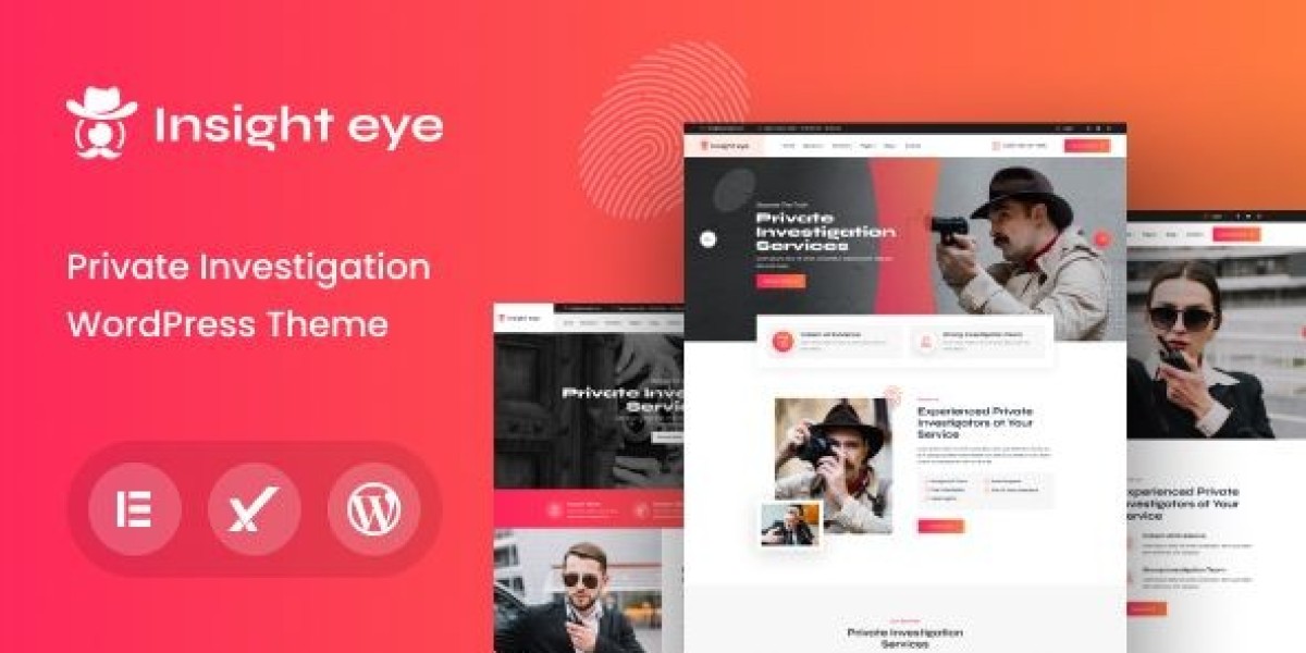
I rebuilt a private investigator site around Insighteye – Private Investigator WordPress Theme because the previous version had a quiet but fatal issue: it behaved like a normal service site, while PI visitors behave like risk-averse decision-makers. They arrive with high sensitivity, low patience, and a deep preference for privacy. If the site asks them to “browse around,” if it feels too dramatic, or if it can’t explain the process without oversharing, they leave. Not because they don’t need help—because they can’t afford to feel exposed.
This isn’t a feature list and it’s not a demo walkthrough. It’s my admin log: how I designed the information flow so it supports confidentiality, what I changed after the site ran for a while, where I reduced friction for mobile visitors, and which maintenance routines kept it stable without turning it into a loud marketing machine.
The real problem: PI websites lose leads by asking for “comfort,” not “certainty”
A lot of PI sites try to look mysterious or aggressive. Others try to look like corporate consulting. In my experience, neither is the core requirement.
The core requirement is certainty:
“Is this service relevant to my situation?” (without forcing the visitor to describe it publicly)
“Will my inquiry be handled discreetly?” (privacy cues, not promises)
“What happens after I contact you?” (process clarity)
“Can I make a low-risk first move?” (minimal intake friction)
“Do you look legitimate?” (credibility cues without showing off)
The mistake I corrected was simple: the old site spent too much time on broad statements and too little time on the steps a cautious person needs to take.
What PI visitors actually do (behavior that shaped the rebuild)
PI visitors are not normal shoppers. Even when they come from search, their browsing patterns are distinct:
They skim headings fast, looking for a phrase that matches their scenario.
They scroll to find contact methods and “what happens next.”
They look for confidentiality language—then they check whether it feels believable.
They avoid long forms. They avoid leaving a trace.
They often revisit the site multiple times before contacting.
This is one of the few niches where “conversion” can be a multi-day decision even when urgency is high. The site must feel safe to return to.
So I designed the structure to support returning visitors: consistent page patterns, predictable microcopy, and a calm “first step” that doesn’t demand disclosure.
Build order: I didn’t start with design, I started with intake risk
I used a sequence that’s more operational than aesthetic:
Define the intake model (what the visitor can share now vs later)
Define services in scenario language (not legal/technical language)
Build the “process” and “confidentiality” page blocks (not a policy page dump)
Build service pages with consistent structure and gentle boundaries
Build the homepage as a router (fast path to relevance)
Tighten mobile UX and page speed, then refine copy
This order prevented the common trap: a beautiful homepage that still produces low-quality or low-volume inquiries.
The content model: I stopped treating every service page like an advertisement
Instead of listing services like a brochure, I grouped them by visitor intent. I did not create a long “services menu.” I created a small number of pathways that match how people think:
“I need to verify something” (factual uncertainty)
“I need documentation” (records, evidence, compliance needs)
“I need to locate someone/something” (time-sensitive but discreet)
“I need ongoing monitoring” (longer engagements)
“I’m not sure what I need yet” (the most common case)
Each pathway page used the same internal pattern:
First screen (mobile) must answer
One-line description in plain language
Examples of scenarios (short bullets, not exhaustive)
The first step (contact) without pressure
A discreet reassurance line about confidentiality (calm wording)
Body must answer
What the first conversation looks like (time, general shape)
What you can and cannot do (boundaries reduce distrust)
What information is helpful (optional, not required)
How outcomes are reported (high-level)
Typical timeline ranges (without fake guarantees)
I avoided dramatic copy. I avoided “we guarantee” language. For PI work, overconfidence reads as unprofessional.
Common mistakes I corrected (these quietly kill PI leads)
Mistake 1: The site asks for too much personal detail too early
Long forms feel risky. A visitor may not know what’s safe to share.
Fix: keep the initial contact request minimal. Make “details later” explicit.
Mistake 2: Confidentiality claims are loud but vague
“100% confidential” means little if everything else feels sloppy.
Fix: show confidentiality through structure: discreet contact options, minimal intake, calm tone, clear process.
Mistake 3: The service pages are written like legal pages
Legal language increases cognitive load and anxiety.
Fix: scenario-first language, then boundaries, then process.
Mistake 4: The site tries to look “intimidating”
In many PI contexts, intimidation is the opposite of trust.
Fix: neutral design tone, clean typography, consistent page structure, restrained colors.
Mistake 5: There is no “what happens next”
Visitors fear being trapped in a sales call.
Fix: explain the first call: what you ask, what you won’t ask, what they can expect afterward.
The “discreet lead flow”: designing a safe first step
A normal service site uses strong CTAs. A PI site needs low-risk steps.
So I treated the lead flow as a set of decreasing-risk options:
“Request a brief consultation” (no details required)
“Ask a general question” (still no details required)
“Share only what you’re comfortable with” (explicit permission to be vague)
“Provide details after we agree on scope” (structure and control)
This approach does two things:
It reduces abandonment.
It attracts more serious inquiries because the visitor feels respected.
I also used a small block that answers: “What should I prepare?” but wrote it as optional guidance, not a checklist demand.
Credibility cues: I used “operational realism,” not flashy proof
PI work is credibility-sensitive. But credibility cues have to be handled carefully; too many claims can feel like theater.
Instead of building a wall of badges, I used subtle cues:
A clear statement of jurisdictions served (where relevant)
A calm note about compliance and boundaries
A transparent intake process
A simple explanation of deliverables (reports, documentation) without overpromising
A short statement on how sensitive information is handled (high-level; no technical boasting)
The goal was: “This looks like a real operation,” not “This looks like a hype page.”
Information structure: I designed pages for scanning, not reading
PI visitors rarely read long paragraphs. They scan headings, then decide whether to trust.
So each page used:
short sections (3–6 lines)
signpost headings that match search intent
a consistent “Process” block (always in the same place)
a consistent “Boundaries” block (always present, calmly phrased)
a consistent “What to expect” block (the anxiety reducer)
The consistency matters. Returning visitors subconsciously learn the layout and feel more in control.
Post-launch observations: what I changed after real traffic arrived
After the site had been live for a bit, patterns emerged:
Visitors often re-check confidentiality cues
They scroll back up, hover around contact areas, and read short privacy-oriented lines.“What happens next” outperforms “About us”
People care less about biography and more about process predictability.Mobile friction is a lead killer
If the contact step isn’t easy on a phone, the inquiry doesn’t happen later.Overly long pages reduce completion
Even if content is “good,” long pages can feel risky. The visitor doesn’t want to linger.
So I adjusted:
shortened intros across pages
moved “what happens next” higher
replaced long blocks with tight sections and clear headings
ensured the first contact path was always visible early
removed any language that sounded like a promise
The site became calmer and more practical. Leads became more serious.
Common misconception: “more content” means “more trust”
In this niche, more content can create more doubt if it becomes repetitive or dramatic.
I learned to prioritize:
fewer pages, better structured
fewer claims, more clarity
fewer demands for user disclosure, more control
Even FAQ sections stayed short and specific. I avoided sprawling knowledge-base style writing because it can feel like an attempt to over-explain.
Light technical notes: privacy isn’t just copy, it’s user experience
I’m not presenting this as a security blueprint, but there are practical UX choices that support discretion:
Keep pages fast and stable on mobile
Avoid aggressive popups that trap attention
Avoid autoplay media
Make contact steps simple and predictable
Ensure forms don’t feel invasive (no unnecessary fields)
A site that feels heavy, noisy, or cluttered makes visitors wonder what else is sloppy. In a PI context, that’s a deal-breaker.
“Boundaries” as trust: saying what you won’t do helps
One of the most effective trust cues was a calm boundaries section. It did not read like a legal threat. It read like operational maturity.
It answered, in plain terms:
what you can’t take on
what requires specific conditions
what you will not promise
This reduced low-quality inquiries and increased genuine leads. People who are serious prefer professionals who set boundaries.
Maintenance routine: keeping the site consistent without turning it into noise
PI sites often rot quietly: outdated pages, inconsistent tone, contact details drifting, and “random” new pages that don’t match the structure.
I used a routine that’s small but strict:
Weekly (10–15 minutes)
confirm contact actions still work on mobile
check that “hours” or availability lines are still accurate
review any new inquiries for recurring confusion points
Monthly (30–60 minutes)
audit top landing pages for clarity and section order
remove redundant paragraphs (PI pages drift into repetition easily)
refine scenario examples to match real inquiries
ensure “process” block remains consistent across pages
Quarterly (1–2 hours)
refresh the homepage routing based on traffic sources
prune thin pages that don’t earn trust
review copy for overconfident phrasing and remove it
standardize formatting so everything reads like one system
This routine was more valuable than adding new pages.
Decision thinking: why I browse theme collections differently for this niche
When I browse collections like WooCommerce Themes, I’m not looking for dramatic animations or “agency” flair. For a private investigator site, I evaluate:
Can the structure support discreet intake?
Can I keep pages consistent and calm across service types?
Does mobile UX reduce friction without feeling pushy?
Can the site feel legitimate without relying on hype?
Can returning visitors navigate quickly without re-learning the site?
A PI site is not a billboard. It’s a controlled intake surface.
Closing thoughts
A private investigator website lives or dies on subtle signals. Visitors arrive cautious. They don’t want drama, they don’t want long forms, and they don’t want to feel exposed. They want to understand—quietly—whether you handle their kind of situation, how you work, what happens after they reach out, and whether the process protects their privacy.
This rebuild focused on certainty: scenario-based navigation, consistent “what happens next” blocks, minimal intake friction, calm boundaries, and a maintenance routine that keeps the site coherent over time. It doesn’t try to “sell.” It tries to make the first step feel safe—which, in this niche, is what turns visits into real conversations.