Plumco Site Notes: Fixing Lead Flow for a Plumber Website
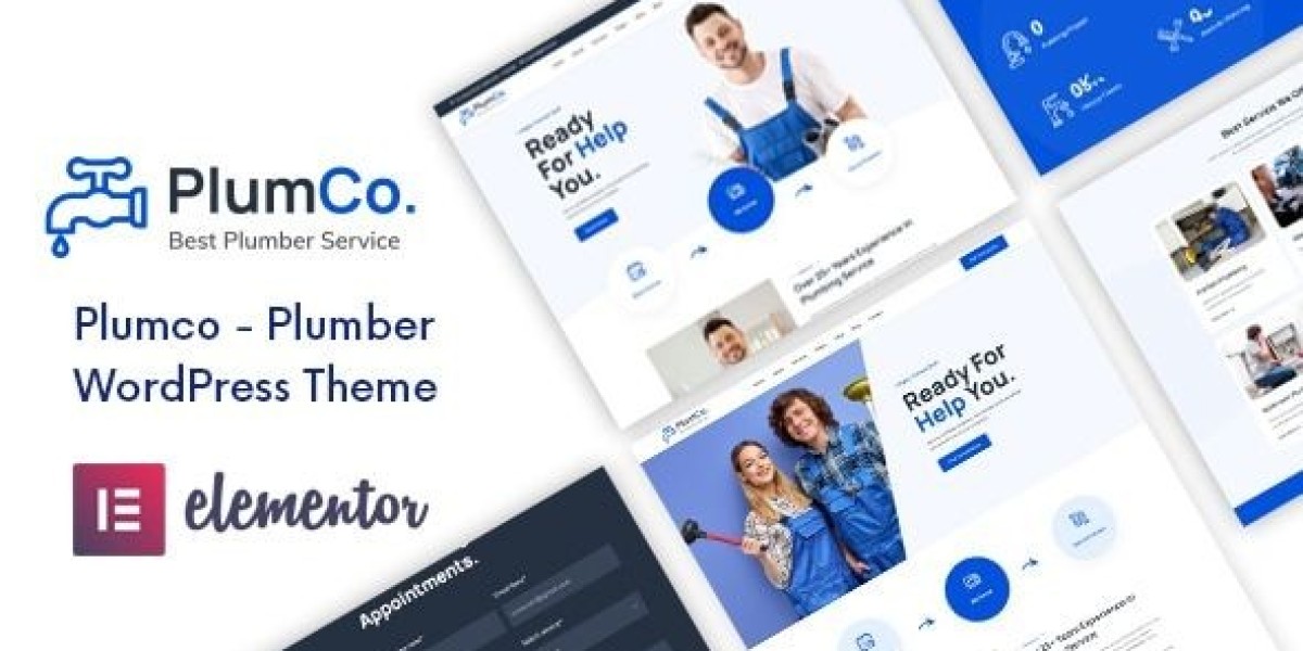
I rebuilt a local service site around Plumco – Plumber WordPress Theme after I realized the previous version wasn’t failing because it looked old—it was failing because it asked the visitor to do too much thinking. Plumbing visitors don’t browse like general shoppers. They arrive with pressure: a leak, a clogged drain, a water heater issue, a renovation quote, or a “please tell me you can come today” mindset. If your site forces them to decode services, hunt for coverage areas, or guess whether you handle their exact problem, they bounce or they call someone else.
This isn’t a feature list and it’s not a demo tour. It’s my admin log: the problems I found, the structure I used to reduce friction, what changed after real traffic hit the site, and what maintenance rules kept it stable. I’m writing this like a calm ops note for other site admins, because plumbing sites don’t need more hype—they need fewer mistakes.
The real problem: most plumber sites don’t have a lead flow, they have pages
The first version of the site had “pages.” It had a homepage, a services page, an about page, and a contact page. But it didn’t have a lead flow. A lead flow is a sequence that answers, in order:
“Do you handle my problem?”
“Are you credible enough to enter my home / handle my building?”
“Can you come to my area and on my timeline?”
“How do I contact you right now?”
“What should I do next if this is urgent?”
When you don’t build that flow, visitors fill the gaps with doubt. And doubt is expensive in local services.
I set a simple goal: reduce the number of seconds it takes to reach certainty on mobile. Not “sell,” just help them decide with minimal friction.
How plumbing visitors actually behave (what I saw in logs and heatmaps)
Even without fancy tooling, you can infer behavior from basic analytics and patterns:
People land directly on a service page from search.
They scroll until they see a phone number or a way to request service.
They skim headings. They don’t read paragraphs.
They look for coverage area and availability cues.
They want proof you do this work often (not one-time, not generic).
They care about trust cues (licenses, insurance, reviews, “what happens after I call?”).
The mistake most sites make is treating plumbing visitors like they’re shopping leisurely. They’re not. Their attention is short and their intent is sharp.
My build order: I didn’t start with the homepage
I rebuilt the structure in this order:
Define service categories and how people describe them (not how plumbers describe them)
Create service landing pages that match those queries
Create “coverage” and “process” pages that remove uncertainty
Make the homepage a router, not a brochure
Tighten mobile layout and contact friction
This order matters because traffic rarely lands on the homepage first. Service pages are the real entrance.
The “service page system” that kept everything consistent
I treated each service page like a repeatable template. That template has to work for emergencies and for planned jobs.
The first screen (mobile) must answer:
What service this page is about (in plain language)
What scenarios it covers (3–6 short examples)
A simple next step (call / request service)
Coverage area hint (city/region)
Hours / emergency availability hint (only if true)
I kept it calm. No inflated claims. Just clarity.
Then, in the body, I forced myself to follow a predictable order:
1) Problem recognition (short)
One paragraph max that mirrors real symptoms, not technical parts.
2) What we do in practice (process, not features)
A short step sequence: diagnose, explain options, do the work, confirm result, cleanup. People want to know what happens.
3) What can go wrong if ignored (risk, not fear)
A few lines on water damage, mold risk, higher repair cost. Not scare tactics—just reality.
4) Pricing approach (not prices)
I avoided fake price ranges. I wrote how estimates work: inspection, parts, labor, approvals. Visitors mainly want transparency.
5) FAQs (short, specific)
Short Q/A blocks beat long paragraphs.
This single template made the site easier to maintain. New services didn’t require inventing new layouts or tones.
The quiet trust cues that worked better than “badges”
Plumbing is high-trust. People worry about scams, hidden fees, and sloppy work. Many sites respond with big badges: “Best,” “Top Rated,” “#1.” That often reads as noise.
Instead, I used quiet operational cues:
A short “What happens after you contact us” section
A “before we start work” explanation (estimate approval)
“What we protect in your home” (flooring, cleanup, shutoff safety)
Clear service area statements
A consistent policy tone (calm, not defensive)
Trust is built by predictable behavior, not by adjectives.
Common admin mistakes I corrected (these cost leads)
Mistake 1: One “Services” page trying to cover everything
A single services page becomes a scroll trap. People search for “water heater repair,” not “services.”
Fix: separate service landing pages, each with its own context and FAQ.
Mistake 2: Hiding the contact path behind navigation
On mobile, the nav menu is friction. Visitors won’t open it if they’re stressed.
Fix: keep a clear contact action visible early on every service page.
Mistake 3: Writing like a brochure instead of a checklist
Plumbing visitors want to confirm, quickly, that you handle their scenario.
Fix: short scenario bullets (“low water pressure,” “toilet keeps running,” “water heater not heating,” etc.). Not a feature list—just recognition cues.
Mistake 4: No coverage area clarity
People don’t want to call just to learn you don’t serve them.
Fix: mention coverage area in a calm, factual way.
Mistake 5: Overlong paragraphs and generic claims
Long paragraphs get ignored. Generic claims get distrusted.
Fix: shorter sections, practical language, consistent structure.
Page flow: how I routed different visitor intents
Not all plumbing jobs are emergencies. I mapped the site into two main paths:
Path A: Urgent intent (today / now)
The page must quickly confirm you handle the problem
The contact step must be immediate
The process must reassure them about what happens next
The language must be calm and clear
Path B: Planned intent (quote / remodel / inspection)
The page must show you can handle projects reliably
The process must include scheduling and estimate steps
The content must feel organized and professional (less “emergency” tone)
The key is not to “sell harder.” It’s to remove uncertainty for each intent type.
Post-launch adjustments: what I changed after a few weeks
After the site ran with real traffic, I looked for practical signals:
which pages had high bounce
which pages had scroll drop-offs
where users hesitated (often mid-page)
mobile vs desktop differences
Patterns I saw:
People scrolled to find “how fast” and “where you serve”
People wanted a simple explanation of the process
People reacted better to specific scenarios than broad claims
Long intros reduced engagement
A consistent layout across services increased time on site
So I changed:
Moved coverage cues higher on service pages
Reduced intros to 3–5 lines
Added a short “What we check first” block
Tightened headings so they read like signposts
Removed any inflated language that sounded like ads
The site didn’t become more “marketing.” It became easier to use.
Light technical notes: speed and stability are part of credibility
Local service sites often ignore performance because “it’s just a few pages.” But mobile users on weak connections care.
I focused on:
keeping the first screen lightweight
avoiding layout shifts caused by large images
minimizing heavy sliders and animations
ensuring click-to-call doesn’t break on iOS
keeping forms simple and reliable
A fast site feels maintained. A maintained site feels trustworthy.
Maintenance routine: keeping the site consistent over time
The biggest enemy of local sites is drift: new pages get added in a different style, phone numbers end up inconsistent, hours become outdated, and service descriptions balloon.
So I used a maintenance routine that’s small but real:
Weekly (10–15 minutes)
check that primary contact actions still work on mobile
verify any emergency-hours claims are still accurate
review any new inquiries for “confusing page” signals
Monthly (30–60 minutes)
audit top service pages for clarity and consistent structure
confirm coverage area text matches reality
review FAQs for new repeated questions
check that titles and headings still match search intent
Quarterly (1–2 hours)
clean up older pages to match the current template
refresh photos if they’re outdated or inconsistent
verify any policy language (estimates, cancellations) is still correct
prune thin pages that dilute the site
Consistency compounds. It doesn’t look exciting, but it keeps conversion stable.
Decision thinking: why this theme style fit the problem
When I browse collections like WooCommerce Themes, I’m not looking for the flashiest homepage. For a plumber site, I’m evaluating operational fit:
Can I build many service pages without layout chaos?
Does the structure support fast mobile decisions?
Can I keep the lead path obvious without looking aggressive?
Can the site stay consistent after months of edits?
Does it feel reliable, not “salesy”?
For local services, reliability is the brand.
Closing thoughts
A plumber website doesn’t win by sounding confident. It wins by reducing uncertainty. Visitors want to know you handle their exact issue, you serve their area, you have a clear process, and contacting you is frictionless—especially on mobile.
This rebuild focused on building a lead flow rather than “pages”: consistent service templates, calm trust cues, clear routing for urgent vs planned intent, and a maintenance routine that prevents drift. If you’re managing a local service site, the compounding advantage isn’t louder copy—it’s clarity and consistency, because that’s what turns stressed visitors into real inquiries without trying to “sell” them.