I Stopped “Designing Pages” and Started Managing a System
The rebuild didn’t start with inspiration. It started with a quiet kind of fatigue: the fatigue of maintaining a WordPress site that looked acceptable but behaved unpredictably the moment I touched anything.
I’ve run enough sites to recognize the pattern. You launch a homepage that feels “done.” You build a few landing pages. You publish a blog layout. You tweak a header here, a footer there. Everything still loads, everything still works, and you tell yourself it’s fine.
Then, over a few months, the small exceptions pile up:
One page uses a different section width because it “needed space.”
Another page hides a button on mobile because it “looked crowded.”
A template is duplicated because you were afraid to change the original.
Some pages are built with one approach, some with another, and nobody remembers why.
Plugin updates become tense, not routine.
The site becomes a museum of decisions you can’t confidently revisit.
That’s the moment I decided I needed a multipurpose theme—not in the marketing sense, but in the operational sense: a foundation that would let me build different page types without constantly inventing new rules for each one.
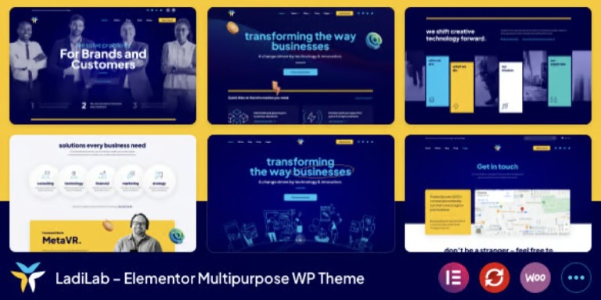
This time, I rebuilt around LadiLab - Elementor Multipurpose WordPress Theme, but I treated it like an infrastructure decision. My goal wasn’t to produce prettier pages. My goal was to produce pages that I could maintain without mental friction.
What follows is a real log of how I approached the rebuild: the decision order, the structural rules, the mistakes I avoided, and what changed after living with the new site for a while.
This is not a feature list. I’m not going to enumerate widgets or claim it solved everything. It’s a practical narrative from the perspective of someone who has to keep a WordPress site stable while constantly adding content.
The problem wasn’t Elementor. It was my “exception economy”
It’s tempting to blame the tool: Elementor is heavy, themes are bloated, WordPress is fragile.
But if I’m honest, the real cause was that I had turned the site into an exception economy—a system where small, local decisions accumulate into global complexity.
The pattern usually looks like this:
I create a page.
Something doesn’t look right.
I create a “quick fix” just for that page.
The page now behaves differently than the rest of the site.
I forget why it’s different.
Later, when I try to standardize, I can’t without breaking something.
It’s not malicious. It’s just how busy site owners survive.
So I made a decision before installing anything:
This rebuild will optimize for repeatability, not creativity.
If a layout choice can’t be expressed as a rule, it’s probably a liability.
That’s the mindset that made a multipurpose theme valuable to me: not because it offered more options, but because it gave me a baseline that I could standardize against.
I chose a “template-first” workflow, even if it slowed me down at the start
In my older setups, I built pages first and templates later. It feels faster because you get visible results quickly.
But it produces a weak foundation. You end up with:
inconsistent headers across page types
pages that don’t share typography rules
repeated blocks that should have been global
a constant temptation to “just tweak this one thing”
So this time I forced the opposite workflow:
Global styling rules (typography, spacing, container widths)
Header/footer behavior (desktop + mobile)
Core templates (pages, posts, archives if relevant)
Reusable sections (hero, CTA, testimonial-like blocks, pricing-like blocks)
Only then: individual pages
It felt slower for the first day or two. But by the end of the rebuild, it was dramatically faster, because everything snapped into place without negotiation.
What “multipurpose” means in practice: a limited number of page shapes
When I say I needed a multipurpose theme, I didn’t mean I needed infinite designs.
I meant I needed a small set of page shapes that could support different content types:
A home-like page that introduces a brand without being a wall of content.
A service-like page that is scannable and doesn’t feel like a brochure.
A case-study-like page that can handle dense content without chaos.
A simple landing page that doesn’t require a custom header every time.
A blog post layout that reads well on mobile and isn’t visually loud.
A contact-like page that doesn’t overcomplicate form placement.
Most sites don’t need more than these shapes. The mistake is letting every page become a new shape.
So I created a rule: no new shapes without a reason.
If a page needed something special, it had to be expressed as a variant of an existing template, not a new template.
That rule reduced my future workload more than any design tweak ever has.
The decision I didn’t expect to matter: container width discipline
This is one of those boring details that decides whether a site feels cohesive.
If you allow different pages to use different container widths, you get:
headings that don’t align across pages
sections that look like they belong to different sites
spacing that feels inconsistent even when it’s technically “correct”
mobile breakpoints behaving unpredictably
So I picked a primary container width and treated it as a law.
Then I allowed only two exceptions:
full-width background sections (content still constrained)
rare “wide” sections (used sparingly, documented)
This changed everything. The site started to look intentional without doing anything fancy.
And, operationally, it made later edits safer because I could predict how a section would behave.
I rebuilt navigation based on how people actually move, not how I want them to
The easiest way to wreck a multipurpose site is to treat navigation like a sitemap.
Visitors don’t navigate like administrators. They follow curiosity, anxiety, and their need to reduce uncertainty.
So before finalizing the header, I watched behavior on the old site:
Most people didn’t read the homepage top-to-bottom.
Many landed directly on an inner page and used the header to orient themselves.
Mobile users either tapped the first obvious item or used search if available.
A surprising number clicked the logo to “reset” when they felt lost.
I designed the header accordingly:
fewer top-level items
clearer labels
a predictable “reset path” (home + consistent menu position)
consistent mobile menu behavior (no clever animation that makes people hesitate)
The goal wasn’t to impress. It was to make navigation feel familiar even to first-time visitors.
I treated the site like a set of flows, not a set of pages
Pages are administrative objects. Flows are how users experience the site.
So I mapped three flows:
Flow 1: Landing → scanning → a decision
This is the “I’m here to understand what you do” visitor.
They need:
a clear first screen
a fast way to scan offerings
a path to a deeper explanation without cognitive overload
Flow 2: Referral → proof → contact
This is the “someone recommended you” visitor.
They need:
reassurance that the site is credible
proof without noise
an easy way to contact without hunting
Flow 3: Returning visitor → action
This is the visitor who already decided.
They need:
minimal friction
no obstacles
consistent placement of calls-to-action
Once I built these flows into the structure, the page design became easier because each page had a role in a flow.
This is where a multipurpose theme becomes useful: it lets you keep the visual language consistent while building different roles.
My “no marketing voice” rule: clarity over persuasion
I deliberately avoided marketing language during the rebuild.
Not because I dislike marketing, but because marketing language often hides structural problems.
If a page is unclear, people try to fix it with adjectives.
I built content with a different standard:
Use plain language.
Explain what the page is for in the first few lines.
Avoid claims that can’t be proven by the structure itself.
Let the layout do the credibility work: hierarchy, spacing, legibility.
A clean page with clear hierarchy can say less and still communicate more.
And for long-term maintenance, calm language reduces the pressure to constantly rewrite.
The operational perspective: updates, stability, and “what breaks first”
As a site owner, I care about what breaks first:
Does mobile header spacing break when Elementor updates?
Do custom fonts load consistently across regions?
Does page speed degrade because I added too many variations?
Do I have duplicated templates that drift apart over time?
Can I revert a change without undoing a week of work?
During the rebuild, I created a habit: every time I created a template or global style, I asked:
“If I forget how this works, will future me be able to fix it quickly?”
That sounds dramatic, but it’s a real test.
If the answer was “no,” I simplified it.
This is why multipurpose themes can be dangerous: they encourage complexity. The key is to use them to reduce complexity, not expand it.
I used fewer plugins not for purity, but for predictability
I’m not anti-plugin. I’m anti-surprise.
The more plugins you stack to compensate for a theme, the harder it is to know where an issue originates.
So I used a simple principle:
if the theme + Elementor can handle it with stable templates, don’t add a plugin for it
if a plugin is essential, make sure its purpose is narrow and its behavior is predictable
This reduced “mystery bugs,” where something breaks and you spend an hour guessing which system is responsible.
Mobile was my main constraint, not an afterthought
I used to treat mobile as “a responsive version of desktop.”
Now I treat mobile as the primary reality and desktop as a luxury.
For many sites, mobile isn’t just traffic—it’s intention:
people browse on mobile
they decide on mobile
they contact on mobile
So I made mobile rules:
No section should rely on hover for meaning.
Tap targets must be comfortably separated.
Headings must not wrap into awkward shapes.
No layout should “jump” while loading.
The top of the page must give orientation quickly.
I didn’t chase perfection. I chased predictability.
When mobile feels predictable, users trust the site more, and I get fewer “I couldn’t find…” messages.
Common mistakes I avoided during the rebuild
Mistake 1: Designing the homepage first
The homepage can look great while the rest of the site is inconsistent.
I built templates first, then the homepage.
Mistake 2: Duplicating templates “just in case”
Template duplication is an easy way to create future inconsistency.
Instead, I created variants and documented the few differences.
Mistake 3: Adding sections because they look nice
Visual filler becomes performance cost and maintenance cost.
If a section didn’t serve a flow, it didn’t ship.
Mistake 4: Leaving typography decisions “flexible”
Typography must be decided early or it becomes a constant debate.
I standardized headings and body text rules early, then stopped touching them.
What changed after launch: fewer edits, fewer “micro-fixes,” calmer maintenance
The most noticeable change after launch was not a spike in traffic or a dramatic conversion story.
It was quieter:
I spent less time fixing spacing issues.
I stopped fearing global edits.
New pages took less time because the shape already existed.
I had fewer “why is this page different?” moments.
This is what good infrastructure feels like: it reduces cognitive load.
The biggest win: editing became a repeatable process
When content is in a stable template, editing becomes mechanical:
update copy
swap images
adjust a section variant
publish
Without stable templates, editing becomes creative again, and creative work is expensive.
Why I still glance at category ecosystems occasionally
Even though I committed to this rebuild, I still sometimes browse WooCommerce Themes the way an engineer reads other people’s code.
Not to copy, but to stay honest:
Is my header still doing too much?
Are my category-like pages (if I have them) scannable?
Am I slowly adding exceptions again?
It’s easy to drift. Looking at other established patterns helps me recognize drift before it becomes debt.
Closing: a multipurpose theme only helps if you refuse to use all of it
My main takeaway from this rebuild is simple:
A multipurpose theme doesn’t automatically give you freedom.
It gives you a lot of ways to create inconsistency.
Used carefully, LadiLab helped me create a site that feels cohesive across different page types, while keeping editing and maintenance predictable. But the real success came from rules:
limited page shapes
template-first workflow
strict container widths
mobile as a constraint
fewer exceptions
clarity over persuasion
Now when I add a new page, I don’t “design” it. I place it into a system. And that’s what I wanted from the start: a site that behaves like a maintained product, not a collection of handcrafted pages.