A Practical Log: Building and Maintaining a Charity Site Without the Usual Noise
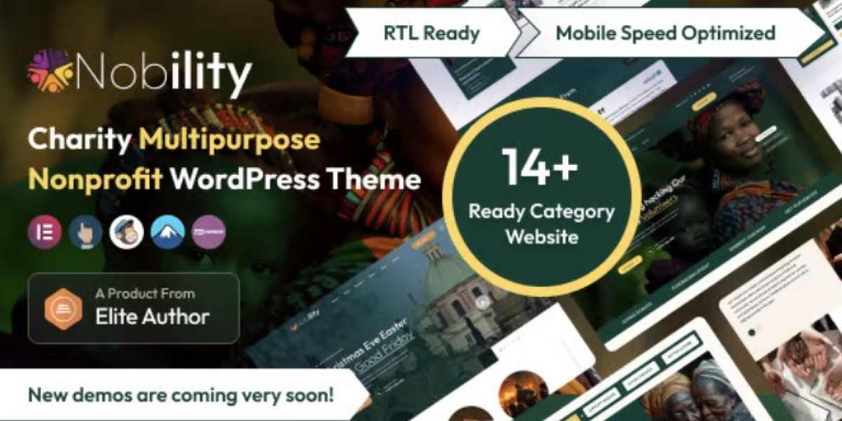
I ended up on Nobility - Charity Nonprofit Multipurpose WordPress Theme for a reason that probably sounds boring: I needed a site that wouldn’t fight me during routine maintenance. Not “pretty demo pages,” not a long feature pitch—just something that behaves predictably when you’re trying to ship changes on a deadline, update plugins without anxiety, and make sure donation-related pages don’t break right when a campaign goes live.
The context matters. I wasn’t starting from zero. The organization already had content scattered across old pages: campaign updates, event recaps, a handful of program descriptions, and the kind of “we should really rewrite this someday” text that accumulates over time. The previous site also carried the usual baggage—multiple page templates with inconsistent spacing, a navigation structure that drifted, and a homepage that tried to do everything at once. My job was less about “building a site” and more about reorganizing a living system while it continued to serve real visitors.
This write-up isn’t a review and it’s not a feature list. It’s the notes I wish I had the first time I handled a nonprofit rebuild with limited time, unpredictable stakeholders, and a requirement that the site stays stable while we rework it.
The starting problem was not design, it was behavior
When people say “the site needs a new theme,” they often mean one of three things:
The site looks dated.
The site is hard to edit.
The site breaks in small, embarrassing ways.
Only one of those is purely visual. In my case, we had the other two.
The editing workflow was messy. A simple update—like adding a new campaign highlight or adjusting a program description—had a habit of shifting spacing or breaking the layout on mobile. The site was also running a mix of historical decisions: old blocks on some pages, a page builder on others, and a few pages that were essentially “handcrafted” with custom HTML and copied sections.
From an admin perspective, the biggest issue wasn’t that editing took longer. It was that editing carried risk. When a routine task feels risky, you end up with a site that rarely gets updated, and that’s the fastest way for a nonprofit site to become irrelevant. Visitors notice staleness. Donors notice uncertainty. Staff lose trust in the site, and then it becomes a place you avoid rather than a tool you use.
So I framed the rebuild around one question: What structure reduces the probability of accidental breakage?
That’s where theme choice started to matter—not as a “look,” but as a foundation for predictable page behavior.
My first decision was to constrain the number of page patterns
Before I touched typography or visuals, I defined a small set of page patterns. This is one of those boring admin moves that saves you later.
I limited the site to a few repeatable structures:
A landing page pattern for campaigns (hero, short context, donation path, proof/updates)
A program page pattern (mission, what we do, how impact is measured, how to get involved)
A content post pattern (updates and stories)
A contact and FAQ pattern
A lightweight event page pattern
I did this because nonprofits tend to grow content in bursts. You might have a quiet month, then suddenly a major campaign or emergency response. If the site allows infinite variation, it will drift again. If it enforces a few patterns, the site stays coherent even when multiple people publish under pressure.
Using a theme like Nobility helped because it nudged me toward consistent section spacing and predictable layout rhythm. I’m deliberately avoiding a “feature rundown,” but I will say this: I didn’t want a theme that encouraged me to invent new page structures every time I opened the editor.
Information architecture was the actual rebuild
The most impactful change wasn’t visual. It was the navigation and the reading path.
On the old site, content was arranged the way internal teams described their work. That’s normal. Internally you might think in terms of departments, committees, or funding lines. Visitors don’t. Visitors arrive with intent:
“Is this organization credible?”
“What do they actually do?”
“Where does money go?”
“How can I help in the next 3 minutes?”
“Is this relevant to my community?”
So I restructured the site around visitor intent rather than internal structure. The key move was to reduce the number of top-level navigation items and make each one behave like a funnel rather than a folder.
I made “Programs” less of a category dump and more of an overview with clear internal paths. I made “Campaigns” time-aware (current campaign versus past work). I treated “About” as credibility (governance, transparency, partners, and measurable impact), not just a history page. And I treated “Stories/Updates” as proof, not as a blog that exists because every site has one.
This sounds obvious, but it’s where most nonprofit sites quietly fail. They publish lots of content but don’t guide anyone through it.
I paid attention to how visitors “scan,” not how they read
When I review analytics on nonprofit sites, a pattern repeats: visitors don’t read linearly. They skim, scroll, bounce, and return later. The same person might visit three times before donating.
So I built pages to survive scanning:
Every page needed a clear opening that answered “what is this page for?”
Every section needed a reason to exist (if it didn’t advance understanding, it got cut)
Important numbers and commitments needed to be visible without being loud
The page needed to remain legible on mobile with minimal effort
This is where I think theme selection matters in a subtle way. Some themes look fine in a designer’s screenshot but collapse into visual noise once real content arrives. I wanted something that maintained readable spacing when the copy got longer than expected, when images varied in size, and when staff inevitably inserted a new paragraph in the middle of a page.
I tested this by doing something unglamorous: I copied real, messy content into draft pages early. Not placeholder text. Real event recaps. Real program descriptions. The stuff that tends to be inconsistent. If the theme survives that, it’s useful.
The “donation path” is a journey, not a button
One common mistake is to treat donations as a single CTA. In practice, it’s a sequence of trust-building steps. Visitors often need to answer a few internal questions first:
Is this legitimate?
Is the mission aligned with my values?
Will my donation matter?
Is the process safe and straightforward?
Can I donate without creating an account or jumping through hoops?
I designed pages so that donation isn’t forced, but it’s always available at the moment someone becomes ready. That meant placing donation entry points in predictable locations and making sure they didn’t disappear as people scroll.
More importantly, it meant building credibility into the page flow. Not with long claims, but with concrete signals: clear impact statements, transparent explanations, and recent updates that show the organization is alive and accountable.
A theme can’t create credibility, but it can either support that flow or fight it by making pages feel cluttered, inconsistent, or fragile.
A low-drama workflow mattered more than “customization”
I approached the build with a “future admin” mindset. I asked: if someone else takes over next year, will they understand how to keep the site consistent?
That meant:
Fewer one-off layout hacks
Less reliance on custom CSS unless it solved a recurring problem
Consistent headings and section rhythm
Clear conventions for imagery (aspect ratios, placement rules, captions)
A simple way to add updates without reformatting pages
I’ve seen rebuilds that look great but fail operationally. The site becomes a museum because only one person knows how it works. For nonprofits, that’s a serious risk.
So I tried to make the site behave like a system rather than a design artifact.
The “page flow” approach: building with sequence in mind
Instead of thinking “homepage, about page, programs,” I built sequences:
Entry: where people land (campaign page, story, social link)
Orientation: a short explanation of what the org does
Proof: impact, updates, numbers, partners, governance
Action: donate, volunteer, contact, share
Return: give people a reason to come back
When you build in sequences, you stop trying to cram everything into the homepage. The homepage becomes an index of pathways, not a narrative essay.
This mindset also prevents a common mistake: adding more and more content to a single page until it becomes a wall.
Rebuild logs: what I actually changed first
I started with a staging environment and did the rebuild in layers. The order mattered.
Layer 1: Baseline stability
I validated core plugin updates first (before switching theme)
I cleaned up unused page templates and identified “special” pages that needed careful handling
I checked the existing site on mobile and documented what already worked (so I didn’t accidentally break the few good parts)
This is where many rebuilds go wrong: you switch theme and then discover you had hidden dependencies all over the place.
Layer 2: Navigation and page skeletons
I built the new navigation structure and created blank pages using the new patterns
I redirected old pages internally (in a controlled way) so that content had a “new home”
I created a small set of reusable sections (not as “templates,” but as patterns staff could copy without breaking consistency)
Layer 3: Content migration and editing
I moved content gradually, starting with the pages that received the most traffic
I rewrote only what was necessary for clarity (a full rewrite can become a never-ending project)
I kept tone consistent and removed internal jargon that didn’t help visitors
Layer 4: Visual polish
Only after those steps did I adjust typography, spacing, and imagery rules. If you start with visual polish, you end up polishing a structure that later changes anyway.
The “common missteps” I kept correcting during edits
This is the part that felt like doing maintenance while driving the car.
Misstep: writing for internal approval rather than visitor clarity
Nonprofit copy often becomes committee-written. It grows cautious and abstract. Visitors don’t respond to that. They need concrete descriptions.
When I encountered vague paragraphs, I didn’t “rewrite everything.” I used a simple rule: if a sentence doesn’t change what a visitor understands or does, it goes.
Misstep: mixing time-sensitive and timeless content
Campaign pages are time-sensitive. Program pages are mostly timeless. Updates are time-sensitive but should remain useful later as proof.
The old site mixed these together. I separated them so the site doesn’t look outdated just because last month’s campaign ended.
Misstep: burying the credibility signals
On many nonprofit sites, the credibility information exists but is hidden in PDFs, footers, or outdated pages. I made credibility part of the normal flow—without making the site feel bureaucratic.
Misstep: allowing infinite section styles
When editors have too many formatting choices, pages diverge fast. I limited what people needed to decide. Less creative freedom, more stability.
How I evaluated “success” after launch
After we launched the rebuilt site, I didn’t judge it by compliments. I judged it by operational and behavioral indicators.
Operational indicators (admin view)
Can staff publish an update without asking for help?
Do updates preserve spacing and typography automatically?
Can we update plugins without layout surprises?
Are new pages following the same patterns naturally?
If the answer is “yes,” the site is maintainable.
Behavioral indicators (visitor view)
Do visitors reach “About/Impact” pages more often after landing?
Are campaign pages keeping people scrolling rather than bouncing?
Are mobile visitors staying long enough to make decisions?
Do returning visitors show up more often?
I’ve learned that the biggest difference between a stable nonprofit site and a brittle one is whether the system supports repeated publishing. If you can keep publishing without fear, the site grows healthier over time.
The invisible work: performance and “perceived speed”
I’m not going to pretend the theme alone determines performance. Hosting, caching, images, scripts—everything plays a role. But I do care about perceived speed because it affects trust. If the page feels slow or jumpy on mobile, people hesitate. That’s not a moral judgment; it’s just behavior.
So I focused on the stuff that usually causes trouble:
Keeping image sizes consistent so pages don’t shift while loading
Avoiding excessive animation or large hero sections that push content below the fold
Ensuring the first screen has a clear message even before everything finishes loading
Making sure the navigation doesn’t lag or flash on mobile
This is also why I avoided building pages that depend on complex stacks of nested sections. Even if it works today, it tends to become fragile after several plugin updates.
A note on “multipurpose” themes and decision fatigue
The “multipurpose” label is often a warning sign, because it can mean “too many options.” In practice, I treated Nobility as a set of guardrails rather than a buffet. I made a conscious effort to not explore every possible layout. I picked patterns early and stuck to them.
This reduced decision fatigue. When you’re building with a team, decision fatigue becomes chaos: every editor has different preferences, and the site loses cohesion.
So my rule became: if a new layout doesn’t solve a real problem, we don’t introduce it. That’s less exciting, but it’s how you keep a nonprofit site consistent across months and staff changes.
User behavior observations that changed how I wrote pages
After launch, I kept watching how people actually moved through the site. Two patterns were especially useful.
Pattern 1: visitors look for “proof” quickly
Even if they arrive from a story, they usually look for something that confirms legitimacy: impact details, transparency, or recent work. If they can’t find it fast, they leave.
So I made sure those proof paths existed on every relevant page, without turning the site into a link farm.
Pattern 2: mobile visitors need earlier clarity
On desktop, visitors can scan navigation and sidebar cues. On mobile, they need earlier clarity in the body content itself. This pushed me to write tighter opening paragraphs and keep early sections purposeful.
This isn’t about marketing; it’s about not wasting someone’s time.
Decision log: why I did A before B
This is mostly for anyone who manages a site and wants fewer surprises.
I did not start by reworking the homepage. I started with the page patterns and navigation, because the homepage is a reflection of your structure. If your structure is messy, your homepage becomes a mess.
I also did not chase perfection in copy. I focused on clarity and consistency first. Nonprofits often get stuck trying to craft the “ideal” mission statement while the site remains hard to use. A clear, maintainable site with decent copy beats a fragile site with “perfect” words.
How I kept the tone grounded (and why it mattered)
Nonprofit websites tend to drift into two extremes:
Overly emotional language that feels performative
Overly formal language that feels distant
I tried to keep the tone calm, direct, and specific. Not cold—just not inflated. Visitors don’t need adjectives. They need understanding.
This also helped internally. When stakeholders see calm, clear language, they’re less likely to request exaggerated edits. The site remains credible because it avoids sounding like an advertisement.
What I would do differently next time
Even though the rebuild went smoothly, there are a few things I’d change if I started again.
I would freeze content earlier
During the rebuild, content continued changing. That’s normal for nonprofits, but it creates drift. Next time, I would set a short “content freeze window” for high-traffic pages so I could migrate without constantly chasing edits.
I would define image rules in writing
People upload images in any shape they have. If you don’t define rules (aspect ratio, placement, alt text conventions), pages become visually inconsistent fast. I eventually wrote a short internal guide, but I should have done it earlier.
I would create an “update cadence” plan
A nonprofit site feels alive when updates are predictable. Even short updates help. I would plan a publishing cadence in advance—one that staff can realistically maintain—so the site doesn’t go quiet after the rebuild excitement fades.
Where this sits in the larger ecosystem
I’m not running a single isolated site. I manage multiple WordPress installs, and I’ve learned that maintainability scales better than customization. If a site needs constant babysitting, you eventually avoid it. If a site behaves consistently, you trust it, and then you publish more.
That’s why I treat themes as operational tools, not aesthetic identities. For a nonprofit, identity comes from work, transparency, and the stories you can reliably publish—not from how many layout variations you can build.
A quiet note on browsing experience
One thing I pay attention to—maybe too much—is whether the site “feels” like it respects the visitor’s time.
Are headings meaningful, or are they decorative?
Does the page get to the point?
Are there obvious next steps without shouting?
Does the site work the same way across pages?
When those answers are “yes,” visitors relax. They don’t consciously think “this is well-structured,” but they behave as if they trust it.
That’s what I wanted from this rebuild: fewer surprises for visitors, fewer surprises for admins.
A practical takeaway list (without turning it into a checklist)
If you’re a site admin thinking about a charity/nonprofit rebuild, the best decisions I made were these:
I constrained the number of page patterns early.
I built navigation around visitor intent, not internal structure.
I moved content using real text early to test layout behavior.
I optimized for low-drama editing and future maintenance.
I treated donation as a journey, not a button.
I observed post-launch behavior and adjusted the flow.
And yes, using a charity-oriented theme like Nobility helped—but not because of flashy demos. It helped because it let me keep structure consistent while I focused on the parts that matter: clarity, trust, and operational stability.
Closing reflection: the site is never “done,” but it can become stable
After a few weeks of real use, the biggest win wasn’t aesthetic. It was that the organization started publishing again without fear. Updates went live without someone asking “will this break the layout?” New pages followed the same rhythm because the patterns were clear. The site started to feel like a tool rather than a fragile artifact.
That’s the kind of success you don’t screenshot. You notice it when the site keeps working during busy weeks—when a campaign launches, when a story needs to go live, when staff changes happen—and nothing collapses.
If you’re building or maintaining nonprofit sites regularly, it’s worth browsing more than just one theme and understanding the broader ecosystem of WordPress Themes—but whichever route you choose, the lesson stays the same: prioritize structure and maintenance discipline over novelty. That’s what keeps a nonprofit site credible over time.