A Store Rebuild Log: What I Changed First, and What I Refused to “Optimize”
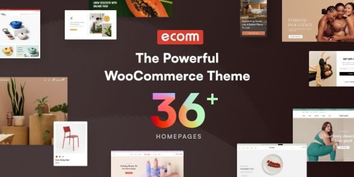
I rebuilt a small WooCommerce store this season not because I wanted a new look, but because the old site had become fragile in the most annoying way: it mostly worked, until it didn’t. Small edits caused spacing shifts. A plugin update changed a layout edge-case. Mobile checkout felt unpredictable. I chose Ecomm – The Powerful WooCommerce Theme as the base layer, then treated the rebuild like an operations project rather than a design project—define the flow, reduce entropy, and make future changes cheaper.
This is not a template-style review, and it’s not a feature list. It’s the notes I keep for myself: decisions, trade-offs, and how the store behaved after real traffic and real orders. If you maintain stores for a living, you already know the truth: a theme doesn’t “increase conversion.” A system reduces confusion. Confusion reduction is what conversion often looks like from the admin side.
The original pain wasn’t speed. It was unpredictability.
When store owners say “the site feels slow,” they sometimes mean “I can’t trust it.”
The old store had three predictable failure modes:
Editing drift
A landing page built in one style, product pages in another, category pages in a third. Each page was “fine,” but maintenance became expensive. If we changed typography, half the site needed manual adjustment.Flow ambiguity
People landed on product pages from search and didn’t know what the next step was. Not because the product was unclear, but because the page didn’t guide the “I’m considering” visitor into a “I’m ready” action smoothly. The store had information, just not in a sequence.Mobile friction
On desktop, the site looked competent. On mobile, it felt like a long scroll of blocks. Add-to-cart was not consistently visible, and the gap between “I like this” and “I finished checkout” contained too many small interruptions.
So the rebuild goal became simple: make the store predictable for both customers and administrators.
I didn’t start with a homepage. I started with a map.
I always start rebuilds by writing a basic map of page types. Not page titles—types. If you can’t describe the store as a few repeatable systems, you’re going to rebuild one-off pages forever.
My map was:
Home (orientation + current priorities)
Category pages (discovery + filtering)
Product pages (decision support + purchase action)
Cart (review + correction)
Checkout (completion)
Account pages (post-purchase trust, returns, downloads, addresses)
Policy pages (quiet, factual, findable)
Then I wrote a second map: the visitor states.
new visitor who doesn’t know the store
visitor who knows the product type but not this brand
visitor comparing similar items
returning customer who wants to buy fast
customer who has a problem and needs support
Most themes are designed around “new visitor impressions.” Real store maintenance is designed around all five states.
My rule for rebuilds: optimize for decision clarity, not decoration
I used to lose time adjusting visuals too early. Now I push visuals later and treat them as the last layer.
The rebuild order I followed was:
Normalize the navigation structure
Fix category browsing (filters, grid rhythm, pagination behavior)
Standardize product page sections (sequence, not features)
Make cart + checkout boring and stable
Only then adjust typography, spacing, and “feel”
This matters because the site can look better while still being confusing. I’d rather ship a calm, consistent store than a dramatic layout that creates friction.
I rebuilt category pages as “decision funnels” without sounding like a funnel
Category pages are where many stores quietly fail. People browse, click, return, browse again, then leave. Admins interpret that as “we need better products” or “we need ads.” Sometimes you simply need better browsing structure.
I asked myself: what is the purpose of a category page?
Not “show products.” That’s the obvious part. The purpose is:
help someone define what they’re looking for
reduce the number of clicks needed to reach the right product
make it easy to compare without feeling overwhelmed
I made a few structural decisions:
1) I reduced the number of category entry points
The old navigation had too many categories. It felt comprehensive, but it created decision fatigue. On mobile, it was especially harsh.
So I collapsed categories into fewer top-level clusters. Inside each cluster, the category page copy explained the differences in plain language. No marketing. Just “if you want X, start here; if you want Y, start there.”
2) I treated filtering as part of the page, not as an “advanced feature”
Most visitors won’t use filters unless they are presented gently. If the filter panel looks like a control panel, people ignore it. If it looks like part of browsing, they use it.
I kept filters limited. Too many filters make the store feel complicated, and complicated stores reduce trust. I’d rather offer fewer filters that match real buying behavior than a long list that only admins understand.
3) I made the product grid rhythm consistent
This sounds boring, but it matters. When the grid rhythm is consistent, people compare faster. When it’s inconsistent, people slow down.
Grid consistency includes:
image aspect ratio
title length constraints
price placement
consistent spacing between cards
I didn’t chase clever layouts. I chased scan-ability.
Product pages: I stopped thinking like a seller and started thinking like a hesitant buyer
The biggest change I made was to rebuild product pages around a sequence of questions. Not a list of “what this has,” but “what I would ask if I’m not sure.”
The questions usually are:
What is this, in one sentence?
Is it for someone like me?
What do I get, concretely?
What happens after I buy?
What if it doesn’t work for me?
If your product page answers these in a calm order, most of the work is done. The theme is just the presentation.
The structure I standardized
I used the same section order for most products, with some variations for complex items.
Opening summary (short, factual)
Context (who this is for, what problem it solves)
What’s included (concrete deliverables, not hype)
How it fits (compatibility, requirements, operational notes)
Purchase + after-purchase (delivery, access, support expectations)
FAQ (only real questions)
Notice what I avoided:
long “features” blocks
loud badges
gimmick counters
aggressive urgency
None of those are needed for a stable store. They can even reduce trust if the product is professional.
I wrote intros that don’t sound like a landing page
Most product intros are either too short (“Amazing product…”) or too long (a full essay before the price). I wrote intros like admin notes:
This is what it is.
This is who it fits.
This is what it changes operationally.
If the first paragraph reads like a brochure, I rewrite it.
Checkout: I made it as boring as possible
Checkout is not a place to educate. It’s a place to complete. Many stores make checkout heavy:
extra blocks
cross-sells
extra fields
unnecessary steps
Every extra step creates more failure points: slower load, more validation errors, more mobile friction, more customer doubt.
My checkout philosophy is: remove anything that’s not required for payment and delivery.
I also tested checkout in a specific way:
as a first-time visitor on a phone
with autofill disabled
with slow connection simulation (just practical throttling)
with multiple payment methods
with a “change my mind” behavior (remove item, apply coupon, change quantity)
If checkout breaks under “hesitant behavior,” you’ll lose real customers. Checkout needs to handle indecision gracefully.
“Powerful” themes can tempt you into complexity—so I set boundaries
E-commerce rebuilds fail when admins keep adding. A store becomes a layer cake of widgets and sections that all want attention. The result is noise.
So I set two boundaries:
One primary action per page
On product pages, that action is add-to-cart. On category pages, it’s “click into a product.” On cart, it’s proceed to checkout. On checkout, it’s pay.No new section unless it solves a real repeated question
If a customer asks the same question repeatedly, add a section. If it’s just “nice to have,” don’t add it.
This boundary saved a lot of rebuild time because it prevented the classic spiral: “We should add testimonials here… and a trust badge… and a countdown… and a bundle block…”
I’m not against those elements. I’m against adding them without evidence.
My decision process for theme selection was boring—and that’s the point
When I select a WooCommerce theme baseline, I’m not judging beauty. I’m judging how it behaves when you remove half the content, and how it behaves when you add more content than expected.
My test checklist looks like this:
Does the layout remain coherent with short product titles and long ones?
If I delete a hero section, does the page still look intentional?
If I add two paragraphs, does spacing collapse?
Does mobile show the purchase action predictably?
Does the theme fight WooCommerce defaults in risky ways?
I also look at how much the theme tries to “own” everything. If it’s too opinionated, it can become fragile.
Ecomm felt like a reasonable baseline for building a store system—something that can be simplified and still look deliberate.
I did a soft launch on purpose
Instead of flipping the entire site at once, I staged it:
Rebuilt one category path fully (category → product → cart → checkout)
Migrated a small set of products
Tested behavior for a week
Then expanded to the rest
This reduced risk. It also prevented the admin team from being overwhelmed by new editing patterns.
If you rebuild everything and launch in one day, you’ll spend the next week fixing dozens of small mismatches. A staged launch helps you catch the system errors early.
Post-launch: the store changed in small, measurable ways
I don’t like dramatic claims. But I do like operational indicators.
After launch, I noticed:
fewer support messages like “where is my order” or “how do I download”
fewer abandoned carts that looked like “I added and left immediately”
more orders from mobile relative to desktop (which usually signals less friction)
fewer internal admin complaints like “this page doesn’t match the rest”
The biggest difference was not “more traffic.” It was fewer points of confusion.
Common mistakes I corrected during the rebuild
Mistake 1: treating the homepage like a catalog
A store homepage doesn’t need to show everything. It needs to orient.
The old homepage tried to display too many categories and too many products. It became noisy.
So I rebuilt the homepage as:
a short orientation block (“what this store is about”)
a few clear entry paths
limited curated product sections that match current priorities
a small trust/context area (factual, not hype)
If visitors want everything, they go to categories. The homepage is a guide, not a warehouse.
Mistake 2: overwriting product pages with “education”
Education belongs in a blog or guide, not in the product decision sequence.
I kept product pages concise and moved deeper education into a separate content area (internal docs / blog), without forcing it into checkout flow.
Mistake 3: using too many visual styles
Consistency is a trust signal. If every section looks different, it feels stitched together.
I standardized typography, spacing, and button styles early in the second stage of the rebuild. It made the entire store feel calmer without adding a single new “conversion” element.
Mistake 4: letting plugin UI dictate layout decisions
WooCommerce stores accumulate plugins. Each plugin wants to add UI. Some of it is useful; some is noise.
I made every plugin UI element earn its place:
Does it answer a common question?
Does it reduce support workload?
Does it help customers decide?
Does it create friction?
If it failed those, I removed it or moved it away from the purchase path.
User behavior observation: most visitors don’t “browse,” they “confirm”
I used to assume people browse stores like a mall. In reality, many visitors arrive with an intent shaped by search or referral.
They click a product, scan quickly, and try to confirm:
Is this store credible?
Is this the right item?
Can I complete the purchase safely?
If your page helps them confirm quickly, they continue. If it makes them decode the layout, they leave.
This is why flow matters more than “cool sections.”
Mobile: I designed for thumbs, not for screenshots
On mobile, the biggest killers are:
sticky bars that cover content
add-to-cart buried too far down
too many collapsible blocks
heavy images above the purchase action
text that wraps in awkward ways
I tested real behaviors:
one-handed scrolling
switching between tabs to compare
coming back after a few minutes
trying to find shipping/payment information quickly
I didn’t chase the perfect mobile design. I chased the “no surprises” design.
Maintenance: the part nobody writes about, but everyone suffers
After the rebuild, the admin workload changed. That’s the real score.
Here’s what I did to keep the store maintainable:
1) I defined editing rules
Not a big policy document—just a short internal checklist:
Product titles should stay within a reasonable length
First paragraph must be a factual summary
Use the same section order across products
Avoid one-off styling changes
Images follow the same ratio
A store without editing rules will drift back into inconsistency.
2) I established a “monthly cleanup” routine
Once a month:
check top landing pages for layout drift
verify checkout flow after updates
fix the worst 5 product pages (based on support messages)
review mobile behavior briefly
This prevents entropy. Most site problems are slow problems. A cleanup routine makes them manageable.
3) I treated updates as a workflow, not an event
When the theme or WooCommerce updates, I don’t update blindly. I update with a simple set of checks:
product page loads
add-to-cart works
cart updates quantity
checkout loads
payment test completes
thank-you page renders
account page works
If you keep those stable, the store feels stable even as it evolves.
A quiet note about theme browsing and restraint
When I was planning this rebuild, I looked through many WordPress Themes because I wanted to see how different baselines handle store structure. The temptation in theme browsing is always the same: you see a dramatic demo and imagine your store will become “premium” instantly.
But premium in e-commerce is often restraint:
fewer competing elements
more consistent spacing
clearer text hierarchy
predictable navigation
calm checkout
That’s the direction I followed. The store became less flashy, but more coherent.
What I would do differently next time
No rebuild is perfect. If I started again, I’d make two changes earlier:
I’d write microcopy first
Many “design problems” are actually wording problems. Short, precise copy makes layouts easier.I’d standardize product photography earlier
Image inconsistency creates visual noise even if the layout is perfect. I would impose image rules earlier to avoid later cleanup.
Everything else I would repeat: map page types, define visitor states, rebuild category flow, standardize product sections, and keep checkout boring.
Closing thoughts: the store became a system, not a collection of pages
After launch, the best outcome wasn’t a perfect-looking homepage. It was the reduction of little problems:
fewer pages that needed custom fixes
fewer customer confusions in checkout
fewer admin interventions after minor edits
more confidence when updating
Ecomm served as a baseline while I focused on the real work: structure, flow, and maintainability.
If you’re rebuilding a WooCommerce store, my calm advice is simple: don’t chase cleverness. Decide what the store should do, reduce friction in the sequence of decisions, and keep your system consistent so it survives real content changes.