I Rebuilt an Astrology Site by Treating “Trust” as an Information Problem
This project looked simple at first: an astrologist site, a few service pages, a booking/contact flow, a blog, and a handful of content categories (horoscopes, guides, “about sessions,” maybe a small shop later). The first version went live quickly. It looked coherent. It even felt “on brand.”
And then I watched how people actually used it.
They didn’t browse it like an eCommerce site. They didn’t behave like they were shopping. They behaved like they were trying to decide whether a person was credible. They scrolled, paused, read, bounced, came back through search, and read again. Some visitors opened the site on mobile late at night and stayed longer, but clicked less. Some visitors skimmed the homepage, ignored big sections, and went directly to the most “plain” page. A surprising number landed on a blog post first and never touched the homepage.
That’s when I stopped thinking about the site as “design pages,” and started thinking about it as a trust-reading environment.
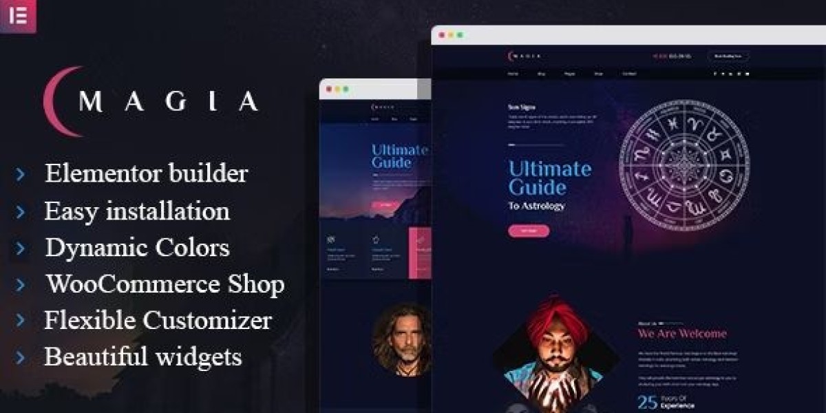
I used Magia – Astrologist WordPress Theme as the base. This is not a demo review, not a feature list, and not a persuasive pitch. It’s an admin log about structure, decisions, and the boring rules that keep a sensitive niche site stable without turning it into a marketing brochure.
To keep myself honest: I’m writing this as the person who has to maintain it, publish content, keep it fast enough, and prevent it from drifting into either “too mystical” or “too corporate.”
The real trigger: People weren’t asking “Is this pretty?” They were asking “Is this safe?”
In most niches, visitors decide in public: compare prices, skim product lists, click add-to-cart. In astrology and similar personal services, visitors decide privately. The decision is not only “Do I want this?” It’s also:
Is this person grounded or performative?
Will I be judged?
Will I be pressured?
Is the process clear enough that I can relax?
Will I regret sending a message?
If the site feels like it’s trying too hard, visitors interpret it as pressure. If it feels too vague, they interpret it as unreliable. If it feels too mystical, some visitors bounce. If it feels too corporate, others bounce.
So the rebuild was about balance, but not aesthetic balance—informational balance.
My rule for sensitive niches: reduce ambiguity, not “increase persuasion”
Many site owners try to “convert” hesitant visitors by adding more content: more testimonials, more badges, more sections, more claims. That often backfires in a niche where visitors are already cautious.
My approach was:
reduce ambiguity
clarify process
present boundaries
keep language calm
make pages easy to read without being “salesy”
This is where a theme choice matters. A theme can support calm structure—or it can force you into loud visual persuasion. I wanted calm.
When I browse options under WordPress Themes, I’m not looking for the most dramatic demo. I’m looking for a structure that can stay stable as content grows.
Phase 1: I rebuilt the homepage as a “quiet directory,” not a stage
The first homepage looked like many service demos: a hero, a few sections, a long scroll. It was visually fine. But visitor behavior suggested something else:
People scrolled past the hero quickly
People clicked “About” more than “Services”
People spent time on the FAQ-like content but didn’t click obvious CTAs
Mobile users paused on headings and short paragraphs more than on cards
That told me: the homepage shouldn’t be a stage. It should be a directory.
What I changed
I reduced the homepage to a routing page:
Orientation: one short paragraph explaining the site’s purpose in plain language
Paths: three primary routes (about the approach / what a session is / articles)
Boundary cues: a small “what to expect” block, written calmly
Stop: I ended the page earlier than I felt comfortable with
The “stop” was important. Endless homepages feel like persuasion. I wanted the opposite.
Misconception correction: “Astrology sites must feel mystical”
They don’t. Many visitors prefer calm clarity. The theme can carry the aesthetic, but the structure should carry the trust.
I allowed the design to be “soft,” but I kept the content plain.
Phase 2: I rewrote the “About” page as a credibility document, not a biography
The About page is where visitors decide whether the person behind the site is stable. A biography can be interesting, but it often fails to reduce uncertainty.
So I rewrote the About page to answer operational questions:
What kind of sessions do you do?
What do you avoid?
How do you interpret things?
What’s the tone of the session?
What happens after a session ends?
I included one small “how I work” section that reads almost like a process note.
Why this matters
In sensitive niches, visitors are not only evaluating competence. They’re evaluating emotional safety. A clear About page reduces fear.
Phase 3: I rebuilt “Services” into “session definitions,” not a menu
I avoided writing service pages like a list of offers. Lists create comparison pressure and sometimes feel like upselling.
Instead, I treated service pages as session definitions:
a plain description of what the session covers
what you need to prepare
what happens in the session
what happens after
who it’s a good fit for
who it’s not a good fit for
This reduced vague messages. It also reduced the support load because people arrived with better questions.
Misconception correction: “More session types makes you look professional”
It can also make you look like you’re trying to sell. In this niche, too many session types often reduces trust.
I kept session types minimal and used content to clarify differences.
Phase 4: I treated the blog as the real homepage
This is a pattern I see often: visitors don’t start on the homepage. They start on search results and land on a blog post.
So I designed blog posts as first-entry pages:
clear headings
short paragraphs
calm tone
no dramatic claims
internal “next step” block at the end (not a sales CTA, just navigation guidance)
I made sure a blog post could answer:
what this site is
what kind of content it publishes
where to go next if you want a session
This is structural, not promotional.
Phase 5: I redesigned reading flow for late-night mobile visitors
A strange amount of astrology-related traffic happens at night. Mobile users read slowly, often in low light, often without intention to click immediately.
So I adjusted for reading comfort:
increased line height
reduced paragraph length
avoided dense blocks
kept headings calm (no shouting)
removed unnecessary animations
This reduced bounce for mobile readers.
Light technical note: stability matters more than raw speed
A site can be “fast” but feel unstable if:
layout shifts when fonts load
images jump
buttons move
sections animate unpredictably
In sensitive niches, instability feels like unreliability.
So I focused on:
stable typography loading
consistent image ratios
predictable spacing
minimal motion
Phase 6: I added guardrails to prevent the site from becoming a personality performance
Here’s the real maintenance danger with astrology sites:
Over time, you add content and pages that reflect moods:
a dramatic homepage rewrite
a new section style
a different tone in service descriptions
inconsistent “voice” across posts
That’s normal for personal services, but it breaks trust when visitors see inconsistency.
So I created a “voice guide”:
avoid absolute claims
avoid fear-based phrases
avoid “promise” language
use simple verbs
keep boundaries visible
describe process, not outcomes
This made the site feel steady.
User behavior observation: visitors look for boundaries more than promises
Many visitors prefer:
“Here is what a session is like”
over“This will change your life”
So I wrote boundaries into pages:
what I do
what I don’t do
what I can’t guarantee
what you should prepare
This reduces regret and improves inquiry quality.
Post-launch review: what improved in a way I trust
After implementing these changes, I observed:
fewer “uncertain” inquiries (messages with no context)
more inquiries that mention a specific article or question
longer reading sessions on blog posts
more users navigating from content to “what a session is” page
fewer bounces from About page
None of this is dramatic. It’s quiet improvement. That’s what I want for this niche.
Part 2: I rebuilt the contact flow to feel “safe,” not “high converting”
After Part 1, the site was coherent, readable, and calm. But the contact flow was still behaving like a generic service funnel: a form, a few fields, maybe a short promise line. It wasn’t aggressive, but it still felt like a form you’d fill out for any business.
For an astrologist site, that “generic business form” creates friction. Not because visitors dislike forms, but because they don’t know what will happen after they submit one. In a sensitive niche, uncertainty is the main dropout reason.
So I treated contact/booking as a trust interface.
Not in a mystical way. In a practical way.
Phase 7: I replaced the “contact page” mindset with “pre-session briefing”
A normal contact page asks for:
name
email
message
That’s insufficient, but also too open-ended. Visitors either overshare (and regret it), or undershare (and get a slow, confusing reply).
So I turned the contact page into a pre-session briefing:
a short section that explains what happens after submission
a small list of what information is useful
one calm statement about boundaries and privacy expectations
a contact form that doesn’t feel like a questionnaire
The point wasn’t to collect everything. The point was to reduce uncertainty.
What I wrote above the form
Instead of “Get in touch,” I wrote something closer to:
what kind of message will get the best reply
how long replies usually take (without sounding like an excuse)
what happens next (confirmation, scheduling, follow-up)
I avoided dramatic reassurance. I kept it factual.
Common misconception I corrected: “more form fields = more serious clients”
This is a trap. More fields can look professional, but they also raise anxiety.
In this niche, people don’t abandon because it’s hard. They abandon because it feels risky.
So I used minimal required fields and optional prompts.
Phase 8: I added “structured prompts” without making it look like a survey
I did not add a long multi-step form. Instead, I used small prompts that helped visitors write a useful message:
“What are you hoping to understand?”
“Is there a specific topic you want to focus on?”
“Any timing constraints (e.g., upcoming decision)?”
But these were not mandatory. They were suggestions.
This approach improved message quality while keeping the form psychologically light.
The quiet trick: I made it easy to send a short message
Some visitors want to ask one small question before committing. If your site makes them feel like they must “apply” for a session, they leave.
So I designed the contact flow to accept:
short messages
longer messages
uncertain messages
And then I handled the clarification in the reply process (not on the form).
Phase 9: I treated scheduling as a clarity problem, not a feature problem
Booking tools can get complicated. I avoided complexity. I focused on clarity:
what a session is
how long it is
what format it takes
what the visitor needs to prepare
how rescheduling works
I didn’t add more “booking options.” I reduced the number of choices.
Why fewer choices mattered
When people are uncertain, choices feel like pressure. Pressure feels like marketing. Marketing feels unsafe.
So I kept scheduling simple.
Phase 10: I prevented the site from feeling manipulative by removing certain patterns
Some patterns are common on service sites but feel wrong here:
countdown timers
urgency blocks
“limited slots” language
testimonial walls
repeated CTA buttons in every section
Even if they’re true, they don’t feel calm.
So I removed anything that could be interpreted as pressure.
Instead of pushing people forward, I focused on giving them enough clarity to move on their own.
Misconception correction: “Trust is built by proof”
Proof helps, but tone matters more.
If you pile proof on a page, it can read as insecurity. Calm structure and clear process often build trust faster than walls of evidence.
So I used just enough proof, and kept it quiet.
Phase 11: I organized content categories so the site can scale without becoming chaotic
Once the contact flow was calmer, the next risk was scale.
Astrology sites often grow content quickly:
weekly posts
themed series
evergreen guides
“moon cycle” notes
Q&A posts
If you don’t structure categories early, you end up with a blog that feels like a diary. That can be fine, but it becomes hard for new visitors to find what they need.
So I created a small content map:
two or three high-level categories
a predictable post type pattern
one “start here” path
I avoided adding many tags. Tags are easy to add and hard to maintain. Instead, I kept categories small and used internal linking in posts to create guided paths.
User behavior observation: visitors prefer “paths” over “archives”
Archives are for committed readers. New visitors need:
a starting point
a guided sequence
an idea of what they’ll gain by reading
So I wrote “start here” blocks at the top of selected cornerstone posts—short, factual, and calm.
Phase 12: I implemented a drift-monitoring habit, because calm sites drift too
Even after these changes, drift can return:
a new post has a different tone
a new page introduces a new layout style
the homepage grows again
someone adds a “promo” section because it seems harmless
So I created a drift monitor checklist:
Monthly drift checklist
Check homepage length (did it expand?)
Check contact page tone (did it become persuasive?)
Check recent posts for heading consistency
Check mobile reading comfort
Check whether new pages follow existing patterns
This kept the site stable.
Post-launch: the changes that mattered most
What mattered wasn’t “conversion” in a traditional sense. It was:
people submitted messages with clearer intent
fewer anxious or defensive messages
fewer “I don’t know if this is right for me” messages
more visitors reading two or three posts before contacting
fewer back-and-forth clarifications after first contact
The site started to function as a calm guide.


