A Calm Rebuild Log for an OB/Pregnancy Clinic Website
I didn’t rebuild this clinic site because the previous one “looked old.” I rebuilt it because it behaved like a fragile system—one of those WordPress sites where everything is technically fine until you touch it. A tiny edit causes spacing to drift. A plugin update changes the way a hero section stacks on mobile. A form confirmation message disappears after caching. Nothing catastrophic, but enough to chip away at confidence.
A pregnancy/OB clinic website isn’t a brand showcase. It’s a decision and reassurance surface. Visitors arrive with time pressure, stress, or uncertainty. They want clear pathways: how to book, what to expect, where to find doctors, what the clinic can help with, how privacy is handled. If the site forces them to hunt, they leave. They won’t write feedback; they’ll just choose a clinic that feels easier.
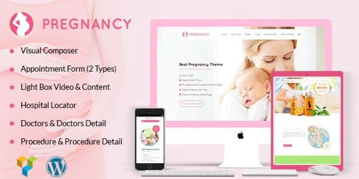
So I rebuilt the site using Pregnancy – Medical Doctor WordPress Theme and treated the work like an operational cleanup: reduce future surprises, make the patient flow obvious, keep mobile calm, and ensure updates don’t create hidden damage.
This is not a feature list. I’m not going to “review the demo.” I’m writing this like I’d write notes for another admin who will inherit the site in six months and wonder why the pages are structured the way they are.
The core problem: clinical websites age under a different kind of pressure
A clinic site accumulates content in a way that’s deceptively difficult:
appointment and contact paths must stay reliable
doctor profiles change and must remain consistent
services evolve (prenatal care, ultrasound, postpartum, fertility support, etc.)
location and hours must remain accurate
policies matter (privacy, cancellation, insurance, emergency guidance)
patient education content can grow endlessly if it isn’t structured
A common failure is that clinics keep adding pages without a structure that supports growth. The site becomes an archive of good intentions: “we should add this page,” “we should add a FAQ,” “we should add a new service section,” until navigation becomes messy and mobile becomes heavy.
The theme choice matters only insofar as it supports a stable structure. What I care about is whether I can build a site that:
makes booking easy without being aggressive
builds trust without sounding like advertising
stays readable and calm on mobile
remains maintainable for real humans who are not web developers
My decision logic: what I look for now (after being burned)
I used to choose themes by how quickly they make a homepage look good. That’s not the right metric. Many themes can make a nice homepage. Fewer can survive real maintenance.
My checklist for this rebuild was operational:
Can I build a consistent patient flow without inventing new layouts each page?
Is the mobile layout naturally readable and stable?
Does the theme support “quiet trust” rather than loud persuasion?
Can the site remain coherent when multiple people update content over time?
Will I understand the site’s logic when I return after a month away?
Pregnancy – Medical Doctor WordPress Theme fit my preference for calm structure. It let me repeat the same page patterns without fighting the layout, which is the key to preventing long-term drift.
The rebuild approach: migration mindset, not redesign mindset
If you treat a rebuild like a redesign, you end up making creative decisions everywhere. That creates maintenance debt. I treated this as a migration with clear phases:
Phase 1: map patient journeys and content types
Phase 2: define site rules (spacing, headings, CTA placement, page structure)
Phase 3: build a small set of repeatable page “templates” (in practice)
Phase 4: move content and rewrite for clarity
Phase 5: mobile-first testing and friction reduction
Phase 6: stability hardening (updates, caching behavior, editor discipline)
It’s not glamorous. But it produces a system that can actually be maintained.
Phase 1: patient journey mapping (what people actually do)
Most clinic websites assume visitors browse calmly. They don’t. Many visitors are scanning while anxious.
I mapped the typical paths I see in clinic analytics:
Path A: “I need an appointment”
They want:
booking method clearly visible
location/hours
what to bring / what to expect
a way to contact without friction
Path B: “I’m checking if this clinic is right for my stage”
They want:
services grouped in a way that makes sense
a doctor profile that feels real
process clarity (first visit, follow-ups, tests)
reassurance about privacy and communication
Path C: “I’m verifying credibility”
They want:
clear doctor credentials and clinic background
a site that feels maintained
consistent language and formatting
no weird layout issues that signal neglect
If your site serves these paths, conversion happens quietly. If it doesn’t, visitors vanish quietly.
So I designed the rebuild around these paths, not around the demo.
Phase 2: setting “site rules” early (anti-chaos)
This is where most clinic sites fail. They keep “tweaking” pages until nothing matches.
I defined rules I refused to break:
one heading hierarchy site-wide
one spacing rhythm between sections
one pattern for doctor profiles
one pattern for service pages
one contact/booking CTA approach (calm, consistent, never spammy)
one tone style: short, factual, respectful, no exaggerated claims
Clinic sites aren’t improved by aggressive language. They’re improved by calm clarity.
Once rules exist, content growth becomes safe.
The most important decision: separating “education content” from “booking content”
A major mistake I saw on the old site: pages tried to do two jobs at once.
A service page would contain:
a long educational article about pregnancy topics
multiple appointment prompts
several unrelated FAQs
random reassurance blocks
That makes pages heavy, hard to scan, and hard to maintain.
So I separated responsibilities:
Service pages: explain what the service is, who it’s for, what the process looks like, and the next step
Education pages / posts: deeper explanations and guidance
FAQs: targeted questions, not an endless list
Policies: kept stable, easy to find, not repeated everywhere
This separation made the site calmer and reduced duplication (duplication is a maintenance nightmare).
A quiet principle: clinics need “predictable reassurance,” not “more reassurance”
Too many clinic sites sound like they’re trying too hard. It can unintentionally reduce trust.
I used a simpler approach:
fewer adjectives
more process clarity
more transparent expectations
less emotional persuasion
Examples of “quiet reassurance” in structure:
explain how appointments work in plain terms
explain privacy and communication boundaries
explain what to do in urgent situations (without alarmist tone)
clarify what the clinic does and does not handle
This is not marketing. It’s respect for the visitor.
Phase 3: building the page flow (structure before decoration)
Instead of building the homepage first, I built the “core operational pages” first:
Appointment / contact path
Doctor profiles (consistent format)
Service group pages
One typical service detail page
Location and hours page (if separate)
FAQ page that does not sprawl
Then I built the homepage as a routing surface:
what the clinic is
what the clinic helps with
how to book
trust signals placed calmly
gentle pointers to services and doctors
The homepage should not be a brochure. It should be a map.
Mobile is the real clinic lobby (and it must feel calm)
Most people will access the site on mobile. Mobile is where trust is won or lost.
My mobile tests are simple:
can I find “book/contact” within one or two screens?
does the page feel readable, not compressed?
do sections stack in a logical order?
does anything “jump” while scrolling?
are tap targets comfortable?
The worst mobile experience is subtle: not broken, just annoying. Annoying feels unsafe in a medical context.
So I adjusted section order for mobile reading:
early clarity (what page is this?)
early practical info (how to book / what to expect)
then deeper detail
reassurance last, not first
This reduced scroll fatigue.
Phase 4: content rewrite (from “brochure” to “process clarity”)
I rewrote many sections with a rule:
Replace vague statements with process clarity.
Instead of: “We offer compassionate care and personalized service…”
I preferred: “First visits usually include X, we’ll discuss Y, and you’ll leave with Z steps.”
Instead of: “We provide complete pregnancy solutions…”
I preferred: “We support prenatal checkups, screening, and postpartum follow-ups, with clear scheduling steps.”
This kind of writing helps the admin too. It makes pages easier to keep consistent. Vague language tends to multiply and drift; process clarity stays stable.
Common admin mistakes I corrected (and how I prevented them from returning)
Mistake 1: Doctor pages written in inconsistent tone
Some profiles were formal. Some were casual. Some were short. Some were long. This creates a weird signal: not professionalism, but inconsistency.
I created a simple profile format:
short introduction
focus areas
appointment approach
clinic values (kept minimal)
practical info (languages, schedules if relevant)
This format prevents future editors from improvising wildly.
Mistake 2: too many contact points with different wording
Different pages had different buttons: “Book,” “Get Appointment,” “Contact Now,” “Schedule Visit,” etc. Not a huge deal, but over time it becomes messy.
I standardized CTA language and placement. Visitors don’t need novelty; they need consistency.
Mistake 3: FAQ sprawl
Clinic owners often keep adding FAQs because it feels helpful. But an endless FAQ becomes clutter.
I limited FAQs to high-frequency questions and moved deeper topics into separate education content.
A non-competitive comparison mindset I used
I didn’t compare the theme against specific competitors. I compared it against two “failure modes” I’ve seen:
Over-designed clinic sites: visually busy, hard to scan, high maintenance
Under-designed clinic sites: stable but cold, hard to trust, unclear flow
Pregnancy – Medical Doctor WordPress Theme let me sit in the middle: calm, readable, structured enough, and not overly decorative.
That middle zone is where clinics usually thrive.
Stability hardening: what matters after launch
Once the site went live, I watched for real-world issues:
caching interfering with forms or dynamic sections
layout drift after updates
content changes breaking spacing
mobile issues from long text blocks
slow pages due to heavy images or scripts
My approach to stability was not “optimize everything.” It was:
standardize image sizes
keep plugins disciplined
test core pages after updates
avoid scattered custom CSS fixes unless documented
If the site depends on hidden tweaks, it will fail when the admin changes.
User behavior observation: patients browse like they want minimal friction
People do not want to “explore” a medical site. They want to confirm, then act.
That means:
service pages must be scannable
doctor pages must feel credible and consistent
booking path must be obvious
contact expectations must be clear
the site must feel maintained
The biggest trust signal is not a badge or claim. It’s a site that behaves predictably.
Where the theme category page fits my admin workflow
While planning future clinic expansions (new service pages, seasonal posts, new doctor onboarding pages), I sometimes review broader theme patterns as a reference library. For that admin-side view, I keep a category page bookmarked: Free Download WordPress Themes.
It’s not part of the patient flow. It’s part of my internal workflow: a reference point when I’m planning structure and want to avoid drifting into inconsistent page styles.
The “after a month” reflection: what changed in maintenance
After living with the rebuilt site for a while:
edits became less stressful
adding new pages didn’t trigger design debates
mobile behavior remained consistent
the site felt coherent even as content grew
updates felt safer because the structure was stable
This is the result I aim for: not excitement, but low-drama operations.
Closing: what I’d tell another clinic site admin
If you manage a pregnancy/OB clinic site, your goal isn’t to “sell.” Your goal is to reduce uncertainty with clarity and stable structure.
The biggest risk is not a slightly outdated design. The biggest risk is letting the site become fragile—so fragile that every edit feels risky. Once edits feel risky, updates slow down. Once updates slow down, credibility quietly fades.
This rebuild reminded me that a clinic website is a living system. It needs calm structure, consistent tone, and predictable behavior on mobile. If you get those right, the site will do its job quietly, without needing constant attention.
That’s the best outcome for a medical site: it works, it stays readable, and it doesn’t surprise you.